ChargeLab App Redesign
ChargeLab
My Role
UX/Product Design Intern
Project Type
Internship Project
Services
Research
Mobile Design
Strategy
Timeline
Q1 2024
DesCription
ChargeLab 2.0 is a conceptual redesign and investigation into overhauling the app’s design system, rooted in user research and feedback. Integrating real-time charger updates, seamless payments, and smart route planning into a single, intuitive experience.
context
As a UX/Product Design Intern at ChargeLab, I worked on this three-month conceptual redesign project to explore how the app could better meet evolving user expectations. The goal was to improve usability, modernize the interface, and create a more seamless, driver-friendly experience in collaboration with ChargeLab’s design and engineering teams.


Problem
EV drivers face fragmented tools for trip planning, charger location, and payments. Constant app-switching leads to delays, frustration, and safety risks. Unreliable charger availability data and complicated payment workflows further disrupt a smooth driving experience.
Challenge
Redesign ChargeLab’s consumer app to create a seamless, all-in-one navigation and charging experience.
(Note: This was a conceptual project developed during my internship to explore future design opportunities for the app.)

Goals
User
Provide EV drivers with a seamless, unified app for trip planning, charger availability, and payments.
Improve usability for quick route adjustments while stopped or driving.
Minimize frustration by providing real-time charger updates and accurate availability data.
Business
Increase app engagement by positioning ChargeLab 2.0 as the go-to tool for EV drivers.
Build a scalable platform for future premium features and partnerships.
Drive user retention by simplifying the charging process and reducing decision fatigue.
Process

Research Insights

To improve ChargeLab’s existing app, I needed to understand how EV drivers engage with it, where they face friction, and what opportunities existed to streamline their experience. Through surveys, user interviews, and usability testing, three key pain points emerged:
Fragmented Tools
EV drivers were frustrated with switching between apps for navigation, charging, and payments, making trip planning inefficient and unsafe.
Complicated Charging Process
Users found ChargeLab’s app hard to navigate, with cluttered menus, too much information, and slow responsiveness for finding chargers or adjusting routes.
Inaccurate Charger Availability
Many users reported unreliable charger data, leading to wasted time, detours, and unexpected delays.
Beyond these general EV charging frustrations, surveys and user feedback revealed usability issues specific to ChargeLab’s current app.
Key Insights from Survey Results
70% of EV drivers said switching between apps for charging was frustrating and unsafe.
68% of participants wanted an all-in-one EV app with navigation, charging, and payments.
82% of users ranked real-time charger updates as their top priority.
Competitive Analysis
The EV app marketplace is crowded with tools for navigation, charger availability, and payment management, but no single app effectively integrates all three. To identify opportunities for differentiation, I analyzed three key competitors:
Key Insights from the Competitive Analysis
Fragmented Features
Most EV apps focus on just one function, like navigation or payment, but none combine all three.
Inaccurate Charger Data
Many apps provide unreliable charger availability, causing frustration.
UI Issues
Many competitor apps have outdated or cluttered interfaces, making it hard for users to find what they need.
App Concept & Creation
ChargeLab’s Existing App


After conducting surveys, user feedback sessions, and competitive analysis, it became clear that ChargeLab’s consumer app was falling short in key areas for EV drivers. Users reported that finding and accessing chargers was frustrating, while competitors were offering partial solutions but failing to fully integrate navigation, real-time charger data, and payments into a single seamless experience.
In response, the ChargeLab 2.0 redesign was developed to tackle three core user frustrations:
Lack of In-App Navigation Support
Users were frustrated by having to switch to third-party apps for directions. They wanted built-in navigation to manage trips and charging in one place.
Clunky & Outdated User Experience
The app was difficult to navigate, with menus that felt cluttered and information that was overwhelming, leading to slower interactions when finding chargers or adjusting routes.
Inconsistent Charger Information
Many users reported unreliable charger availability data, which led to wasted time, detours, and unexpected delays during trips.
User Persona

Emma
The Commuter
“I’ve wasted so much time arriving at chargers that are already occupied. I need real-time updates I can actually trust.”
Key Points
Uncertainty about charger availability
She dislikes arriving at a station only to find it occupied or out of order.
Inefficient multi-app workflow
Juggles navigation, payments, and charger apps separately, making the experience overwhelming.
Finding compatible chargers
She struggles to locate stations that support her EV model.
Emma’s experience isn’t unique. Many EV drivers voiced similar frustrations:
“I don’t have time to search through different apps to find a charger that works for me. I just need one app to do it all.”
- Ryan, Survey Participant
“I need to know the charger will work before I get there. Wasting 20 minutes searching for a new station is unacceptable.”
- Survey Participant
These real-world frustrations reinforced ChargeLab 2.0’s user-first design, ensuring that drivers like Emma and Ryan get fast, reliable, and stress-free EV charging every time.
User Journey


Early Iterations / Sketches

The initial goal of ChargeLab 2.0 was to create a seamless, distraction-free EV charging experience by integrating navigation, real-time charger updates, and payments into a single app. Early concepts focused on effortless on-the-go charging adjustments and eliminating the need for app-switching while driving.
Some initial ideas included a one-tap “Add Charger” button to quickly update routes and smart filtering options for charger availability, price, and wait times. At this stage, dynamic charger status indicators (adjusting opacity instead of color) were introduced to help drivers quickly distinguish available chargers at a glance.

Early sketches also explored gesture-based controls for quick rerouting and a predictive charging assistant that suggested stops based on user preferences and real-time conditions.
Ultimately, real-time charger updates and ChargerMatch’s personalized recommendations became the foundation of ChargeLab 2.0’s redesign, ensuring drivers could plan, charge, and pay in one streamlined experience.
User Flows


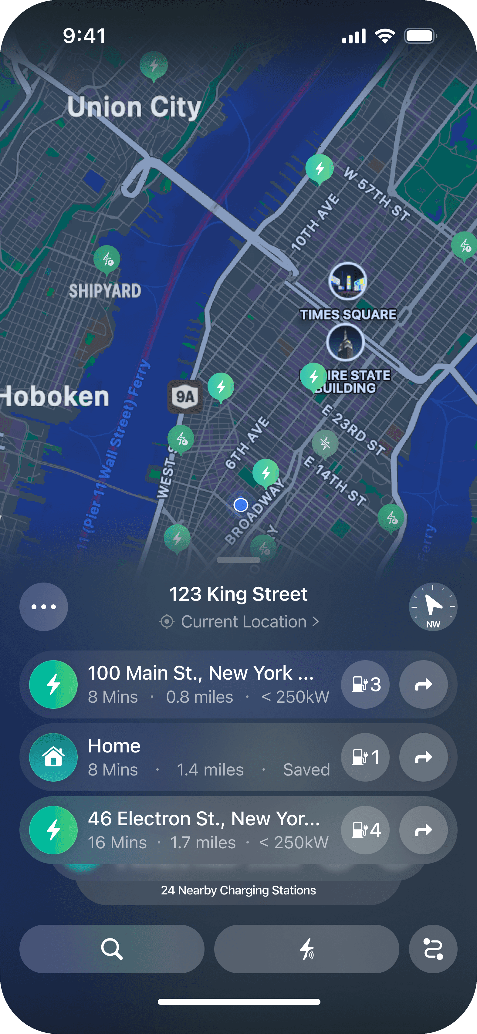
This User Flow was designed to streamline the process of finding, selecting, and navigating to a charger while minimizing distractions. The goal was to ensure quick access to real-time charger data while keeping interactions fast and intuitive for drivers on the go.
To reduce friction, we eliminated unnecessary steps by integrating charger availability, route adjustments, and payment options into a single flow. Users can set preferences, get smart recommendations, and start navigation with minimal taps, allowing them to focus on the road instead of managing multiple apps.
Wireframes


The wireframes for ChargeLab 2.0 focused on creating a quick, intuitive way for users to locate and access chargers without unnecessary complexity. Early designs prioritized simplified navigation, ensuring that drivers could view nearby charging stations, real-time availability, and estimated wait times at a glance.
To enhance usability, I limited the number of on-screen elements to only the most critical details, preventing information overload. Charger selection was streamlined to offer smart recommendations based on user preferences, with one-tap navigation and payment integration. These wireframes laid the foundation for a seamless, distraction-free charging experience, ensuring drivers could make informed decisions in seconds.
Solution
Introducing: ChargeLab 2.0

What is ChargeLab 2.0?
ChargeLab 2.0 simplifies EV trip planning, charging, and payments by integrating everything into one seamless platform, eliminating the need for multiple apps.
What Sets ChargeLab 2.0 Apart?
Smart Route Planning
Routes are optimized based on battery range, live charger availability, and real-time conditions like weather and traffic.
Live Charger Updates
Drivers get accurate, real-time data on charger status, pricing, and wait times across networks.
Effortless Payments
One-tap charging with Apple Pay, Google Pay, or saved payment methods, eliminating manual transactions.
By solving the biggest pain points of EV drivers, ChargeLab 2.0 makes charging faster, smarter, and stress-free. Drivers can stay focused on the road without constantly switching between apps.
A Smarter, More Seamless EV Charging Experience
ChargeLab 2.0 is a fully redesigned EV navigation and charging app that eliminates the frustrations of fragmented tools, unreliable charger availability, and clunky payment processes. The goal was to build an all-in-one platform where drivers can plan routes, view real-time charger updates, and pay within a single experience.

Why an All-in-One EV Charging Solution?
EV drivers depend on navigation, live charger data, and easy payments. But most current solutions split these tasks across multiple apps. This not only wastes time but also increases safety risks by forcing drivers to look at their phones while on the road.
By integrating these core functions into one streamlined platform, ChargeLab 2.0:
Simplifies trip planning with seamless charger integration in route mapping.
Ensures real-time availability data to prevent unnecessary detours.
Provides instant, in-app payments to remove checkout friction.


Why it works
Feedback & Iterations
To modernize the ChargeLab app and improve the driving experience, four interface directions were tested side by side: the Original App, along with three newly designed options (A, B, and C). The goal was to find out which layout best supported safe and efficient use during active driving, especially across different lighting conditions and varying levels of driver attention.
Design Options Tested

Original App (Baseline)
The current live version of ChargeLab: a light-mode layout with minimal visual hierarchy, basic charger cards, and limited navigation functionality. Used as a benchmark to identify where usability fell short.
Option A – Light Mode Refresh
A simplified update to the original app with updated fonts, lighter map visuals, and a more organized card layout. Prioritized visibility in daylight with minimal color usage and reduced clutter.
Option B – Text-Heavy Dark Mode
Focused on detailed charger information and larger tap targets. Used a dark interface with strong emphasis on labels, intended to improve clarity for in-car interactions.
Option C – Icon-First Driving UI
A simplified and more visual take on Option B. Prioritized icon readability, streamlined gestures, and a less cluttered interface to support quick in-drive decisions and reduce distractions.

All four options were tested with EV drivers in a simulated route planning and charging session. Participants were asked to plan a trip, select a charger, and begin a session while simulating in-car use conditions.

Testing Insights
The original app scored lowest, with users noting cluttered layouts and missing real-time feedback.
Dark mode was preferred for being easier on the eyes, especially during night drives.
Option C stood out for its bold design, clear charger info, and smoother driving experience.

Key Decision
Option C was chosen as the foundation for ChargeLab 2.0. It delivered the strongest performance in testing and aligned best with both user feedback and ChargeLab’s vision for a more modern, intuitive charging experience. With this direction, the app now supports real-time alerts, one-tap charging, and a dark-mode interface that meets the needs of drivers on the road.

Prototyped with Real EV Drivers

To bring ChargeLab 2.0 to life, I used CreateWithPlay and other tools like user testing platforms to build, share, and validate the experience with real users and the ChargeLab design team.
Prototyping allowed us to quickly test and refine:
Real-time charger updates and how they appear mid-route
One-tap actions like starting a charge or rerouting due to an unavailable charger
Charging session details, including cost, speed, and live progress tracking
Navigation clarity for drivers on the go
Working closely with testers and the ChargeLab team helped us iterate fast and ensure the final product felt polished, intuitive, and grounded in real-world EV driving behavior.
Colours
Designed for clarity on the road
The ChargeLab 2.0 color system was built to enhance visibility, reduce distractions, and support safe use across both daytime and nighttime driving. It stays true to ChargeLab’s signature gradient while shifting the visual language toward a sleek, darker interface. Transparency, soft layering, and intuitive contrast help drivers quickly focus on what matters without overwhelming the screen.
Primary Brand Colours:
These colours are rooted in ChargeLab’s original brand palette and optimized for EV-first usage, especially while driving at night.
Electric Gradient #2DD5F3 → #3DED91 — Used for charger icons, key highlights, and action buttons to carry over the recognizable brand presence. cleanliness and clarity.
Midnight Slate #0D1B2A — Main dark mode map colour, designed to reduce glare and keep the interface calm and focused.
Glass Panel Overlay (13, 27, 42, 0.55) — Adds a modern, layered feel for floating UI cards and map elements while maintaining legibility.
Status Indicators:
Chargers and route details use bold yet simple indicators that work at a glance.
Available Charger Icon (Green Bolt) #3DED91 — Signals chargers that are ready and active.
Unavailable State (Gray Bolt) #B3B3B3 — Softened to fade into the background while still showing network reach.
Error or Fault Warnings #FF4E4E — Used sparingly to flag broken stations or payment issues.
Typography
SF Pro
Aa
Bb
Cc
Dd
Ee
Ff
Gg
Hh
Ii
Jj
Kk
Ll
Mm
Nn
Oo
Pp
Rr
Ss
Tt
Uu
Vv
Ww
Xx
Yy
Zz
0
1
2
3
4
5
6
7
8
9
ChargeLab 2.0 uses SF Pro and SF Pro Compact to keep the interface clean, clear, and easy to read in motion. SF Pro supports structure across headings, route details, and charger information. SF Pro Compact softens the feel of buttons and labels, helping the interface feel lightweight and responsive.
Together, they create a modern, readable system that balances clarity with comfort. Whether day or night, in or out of the car, the typography helps drivers focus on what matters without distraction.
Accessibility & Scalability by Design

The ChargeLab 2.0 design system was created to scale with the product. Modular components like charger cards and route overlays make it easy to add new features without rebuilding the interface. Everything is designed to adapt across screen sizes while keeping the experience consistent and easy to use.
Prioritizing Accessibility
Accessibility was a core focus throughout the redesign. High-contrast colors, dynamic text, and large tap targets make the app easier to use while driving. By reducing visual clutter and keeping interactions simple, ChargeLab 2.0 supports a safer, more inclusive experience for all users.
Modular components (charger cards, route overlays) allow for easy feature expansion.
Scalable UI system ensures a consistent, adaptable experience across platforms.
Accessibility-first approach guarantees clarity, ease, and efficiency for all users.
Outcome
Outcome


ChargeLab 2.0 is a conceptual redesign that reimagines the EV charging experience by addressing inefficiencies and improving usability. With integrated navigation, charger updates, and seamless payments, this design explores how the app could reduce the friction that often disrupts trip planning and charging. The goal was to show how everything a driver needs could exist in one streamlined platform, without the need to switch between multiple apps..
By introducing features like real-time charger availability and personalized ChargerMatch recommendations, ChargeLab 2.0 aims to help drivers make faster, smarter decisions on the road. The redesigned interface supports quick access to compatible chargers, efficient route planning, and instant payments while minimizing distractions and mental load.
While this was a concept redesign project, the expectation is that these improvements would lead to:
Higher engagement, as users spend less time searching and more time charging.
Increased reliability, with live updates reducing frustration and detours.
More efficient charging sessions, thanks to smarter, data-driven recommendations.
ChargeLab 2.0 ultimately proposes a more intuitive and driver-friendly charging experience, ensuring EV drivers have the tools they need to charge confidently, plan efficiently, and stay focused on the road.


Retrospective
A critical part of any design process is reflecting on what worked well, what didn’t, and where the next opportunities for improvement lie. ChargeLab 2.0 was a research-driven, user-first redesign, but like any project, there were valuable lessons learned along the way.
Usability & Safety at the Core of the Redesign
A Unified UX Research & Design Approach
Research-Driven Decision-Making
Seamless Collaboration with ChargeLab Designers
So what went well?
• Conducting user surveys, interviews, and testing workshops provided valuable insights into EV drivers’ pain points, shaping key design decisions.
• Collaborating with the ChargeLab design team ensured the new UI aligned with brand identity and technical feasibility while improving usability.
• The modular design system allowed for scalability, making future updates and integrations seamless.
• Playing multiple roles as both UX researcher and UI designer helped maintain a holistic approach. This ensured that research directly informed the final design.
That’s nice, but what needs improvement?
• More refined microinteractions and animations could enhance navigation fluidity, making transitions and real-time updates feel more seamless.
• Survey structure could be improved to gather deeper behavioral insights, helping fine-tune personalized recommendations and route adjustments.
• Merging key features like ChargerMatch and real-time updates into a more unified experience could reduce cognitive load, ensuring users don’t have to think too much while driving.
That’s it!
Overall, working on ChargeLab 2.0 was an exciting opportunity to tackle real EV driver pain points and create a more seamless, intuitive charging and navigation experience. A huge thank you to all the survey participants, EV drivers, and testers who provided valuable insights, as well as the ChargeLab design team for their collaboration and feedback throughout the process!