LoopPay
LoopPay
My Role
UX/Product Designer
(Self-Initiated Case Study)
Project Type
Self-Initiated Project
TOols
Figma
CreatewithPlay
Timeline
Q3 2024
DesCription
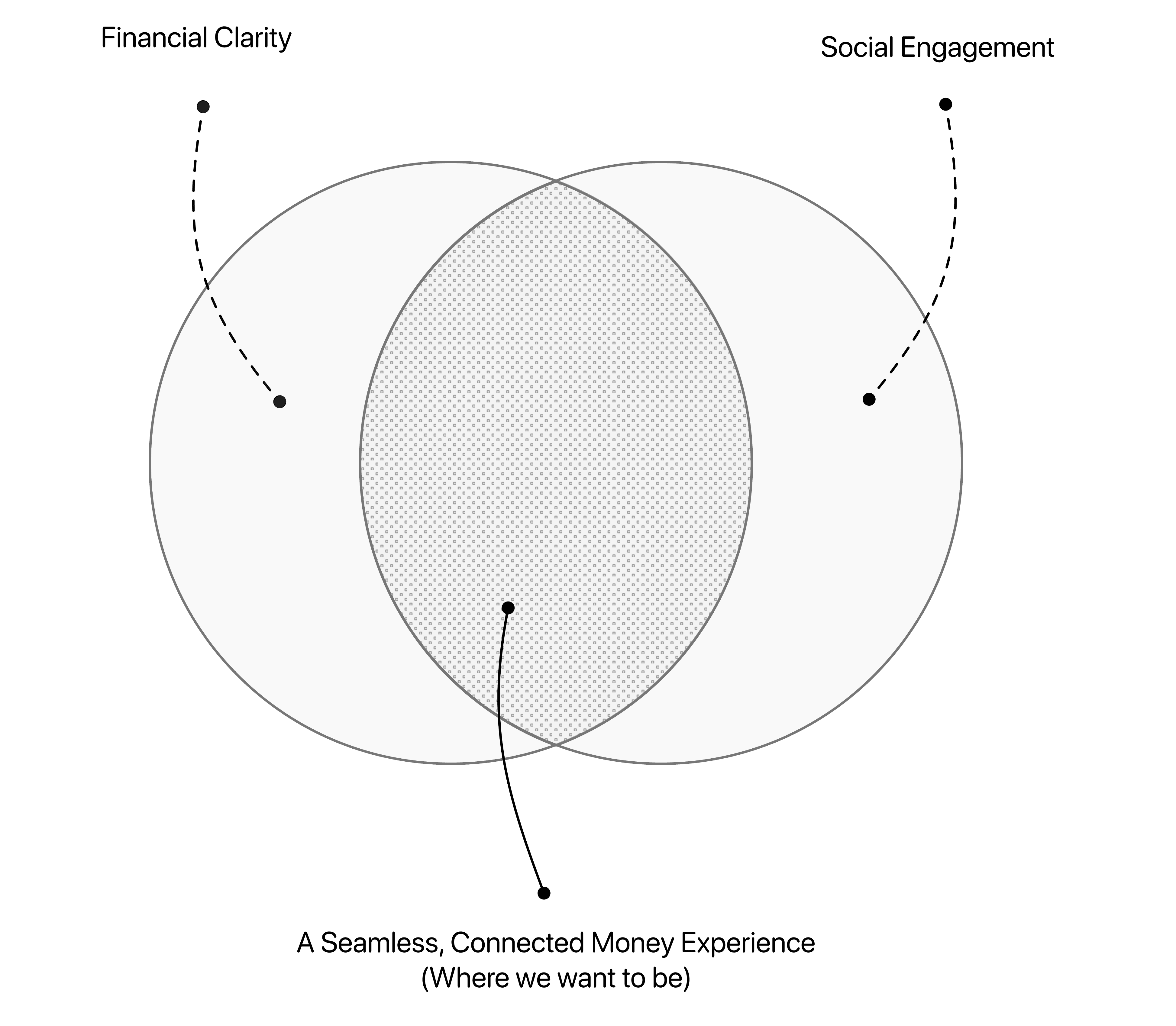
LoopPay is a concept financial app that simplifies personal finance by consolidating multiple accounts into one place, while also introducing collaborative features like group splits and social betting. It blends utility with engagement to help users manage money and connect meaningfully.
context
This was a self-initiated UX case study aimed at solving real user pain points around fragmented banking, awkward peer-to-peer transfers, and the lack of fun, social finance tools. The project showcases my end-to-end process, from research through to interactive prototypes, and reflects my interest in designing for both usability and delight.


Problem
Managing money across multiple bank apps is disjointed and time-consuming. Users juggle different platforms to check balances, send payments, and split expenses, which leads to delays, confusion, and missed opportunities to collaborate. Traditional finance tools also lack engaging features, leaving social interactions like group transfers or friendly bets unstructured and prone to conflict.
Process
Challenge
Design an all-in-one finance app that consolidates accounts, simplifies group transactions, and introduces social betting, all without compromising clarity, trust, or ease of use.
Goals
User
Provide users with a unified platform to manage multiple bank accounts, transfers, and group expenses.
Make sending, receiving, and splitting money fast, intuitive, and conflict-free.
Introduce social betting as a structured, enjoyable way to engage with friends financially.
Build trust through clear terms, automated tracking, and transparency in shared financial actions.
Business
Position LoopPay as a modern alternative to traditional banking and payment apps.
Drive engagement through collaborative features that encourage repeat usage.
Create a scalable foundation for future tools like shared saving goals or premium financial planning features.
Improve user retention by replacing app-switching with a single, seamless experience.
Research Insights
To design a more engaging and seamless financial experience, I needed to understand how users currently manage their money, what frustrates them about existing apps, and what they believe makes a truly great finance tool. I conducted a survey with 50 participants, ranging from casual users to detail-oriented planners, to uncover key opportunities for improvement in the financial app space.
Through survey analysis and early concept validation, I identified three consistent pain points:
Clunky Group Transactions
Splitting costs with friends or roommates often caused friction. Users reported that most apps lacked clarity around who owes what, making group payments feel awkward or unreliable.
Fragmented Account Management
Users were frustrated with switching between multiple apps to check balances, move money, and manage expenses. This led to confusion, missed payments, and an overwhelming experience.
No Fun in Finance
While users enjoyed casual bets or challenges with friends, most avoided them due to the lack of structure, unclear outcomes, and the risk of disputes — something no current app solved well.
These insights directly shaped LoopPay’s feature set, focusing on consolidation, clarity in collaboration, and a modern approach to social finance that blends utility and engagement into a single, cohesive experience.
Key Insights from the Competitive Analysis
58% prioritized “all-in-one account access” as the most valuable feature a finance app could offer.
62% of users felt overwhelmed managing accounts across multiple apps or banks.
68% said group expense splits were often confusing or inaccurate.
Competitive Analysis
The personal finance app space is crowded with tools for payments, transfers, and expense management, but no single app successfully combines clarity, automation, and social engagement into one cohesive experience. To identify opportunities for differentiation, I analyzed three key competitors.
Key Insights from the Competitive Analysis
Fragmented Experiences
Most apps focus on either simple payments or expense splitting, but none provide a seamless, all-in-one solution for managing, sharing, and tracking money socially.
Limited Financial Clarity
Users are often left guessing who paid what or when payments are due, with few tools offering real transparency across shared expenses.
Lack of Social Engagement
While some apps add social feeds, they don’t provide structured, meaningful ways to make financial interactions more engaging or collaborative.
By addressing these gaps, LoopPay positions itself as a modern, social-first financial app that offers users the tools to easily manage money, stay connected, and remove the friction from shared financial moments.
App Concept & Creation
LoopPay
After analyzing survey feedback and conducting a competitive analysis of existing finance apps like Venmo, Splitwise, and Zelle, two recurring frustrations stood out: disconnected account management and friction in social financial interactions. While current apps offer partial solutions, none provided a unified experience that combines smart money movement with social utility.
What became clear is that these two problems are fundamentally different. One is structural; the other, behavioral. Solving them would require distinct yet integrated design strategies.
These insights led to the creation of LoopPay, a concept financial app designed to streamline personal finance while making shared money moments more intuitive and engaging.
What is LoopPay?
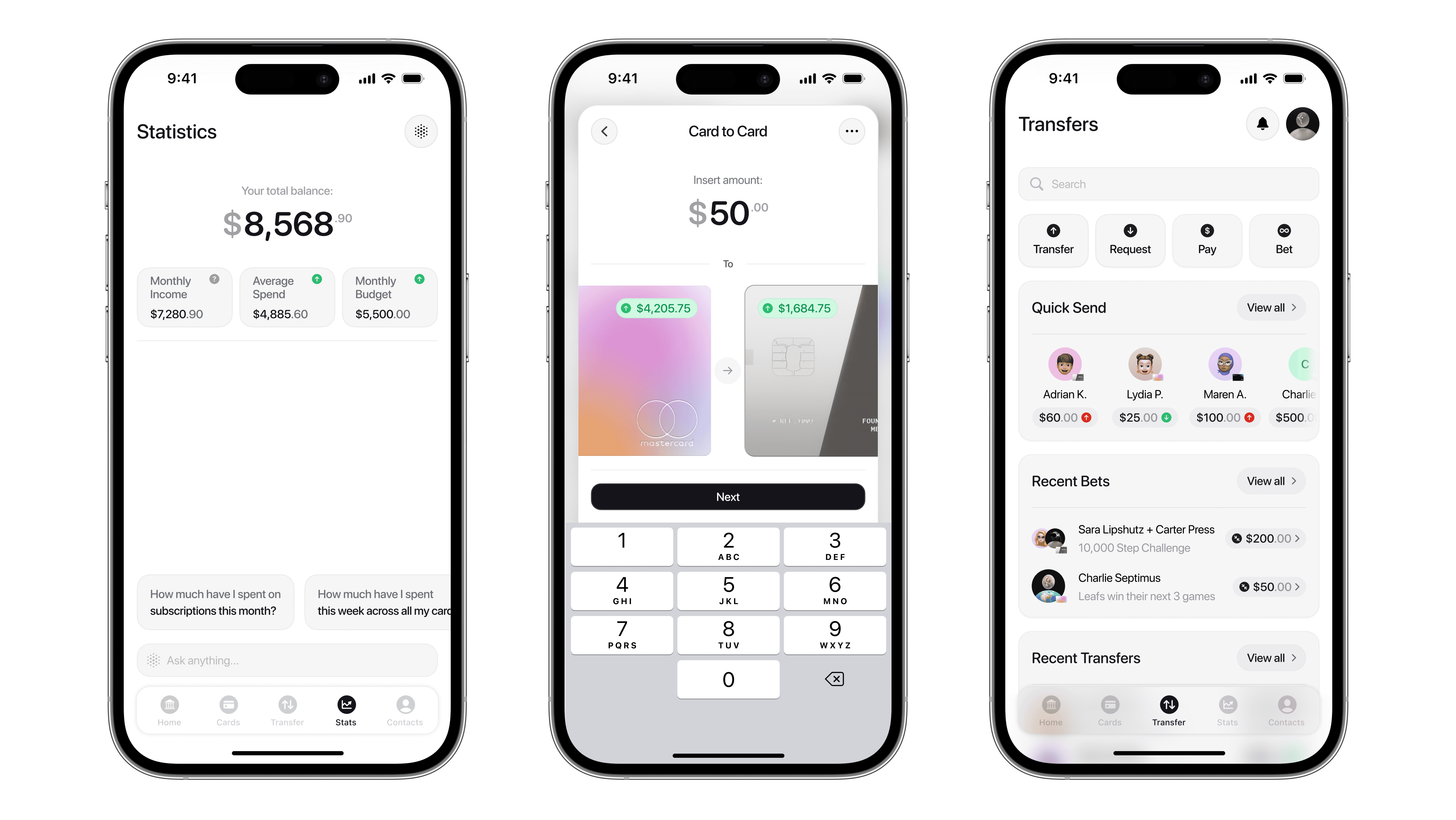
LoopPay is a reimagined finance app that helps users manage multiple accounts in one place while offering collaborative tools to split, send, and even bet money with friends, all in a way that feels clean, social, and secure.

On the surface, LoopPay functions like most digital wallets: users can check balances, send or receive money, and track recent activity. But what sets it apart is its dual focus on efficiency and social collaboration.
While LoopPay includes the expected basics like checking balances, sending money, and reviewing transactions, it also introduces three key innovations that set it apart:
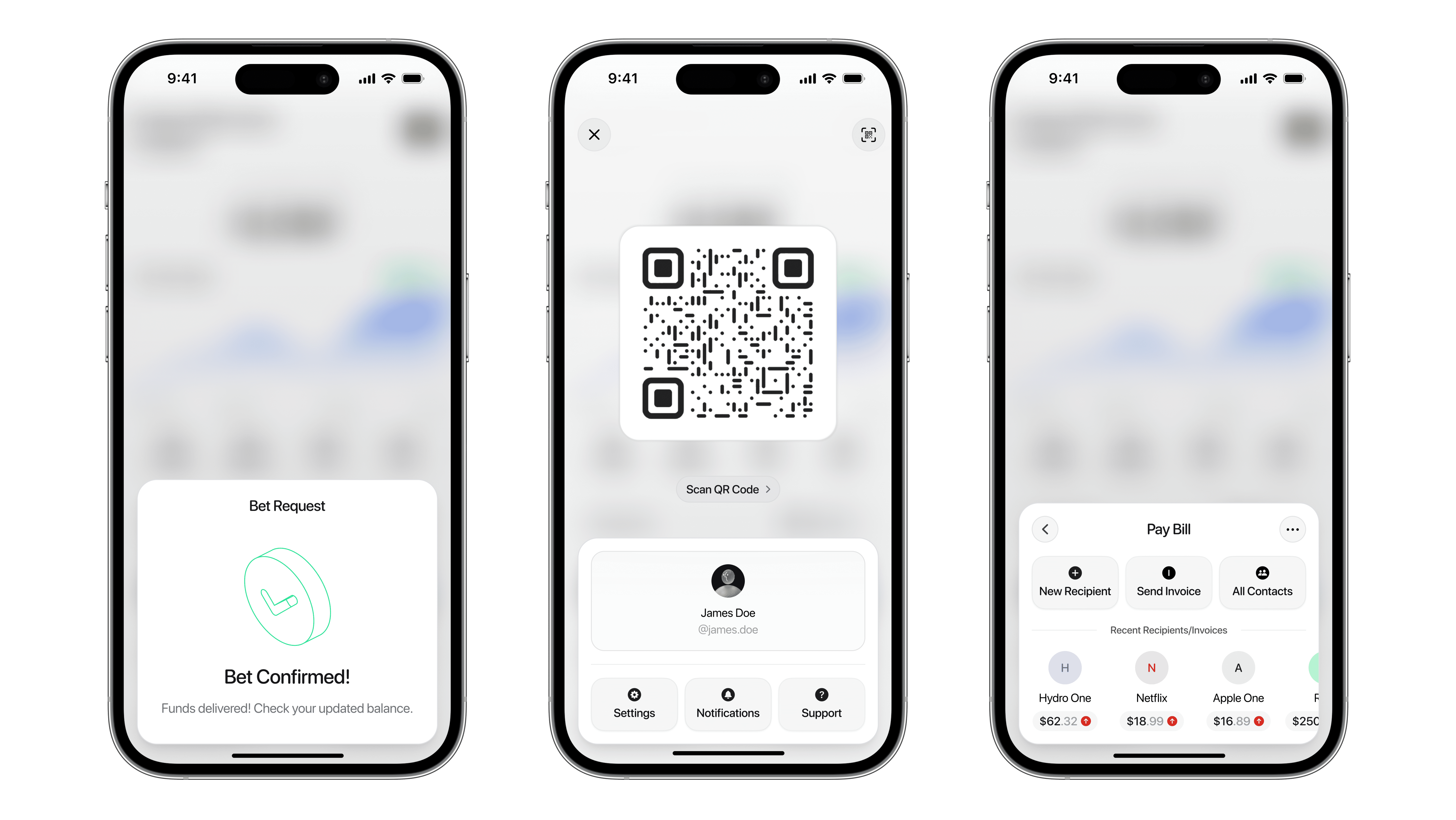
Collaborative Social Betting
A structured, fun way for users to make friendly wagers with friends. Automated collateral, clear outcomes, and optional “Sell Out Fees” reduce disputes and increase engagement.
Enhanced Group Transfers
Features like itemized bill splitting, group requests, and recurring payments give users more control and clarity when managing shared expenses.
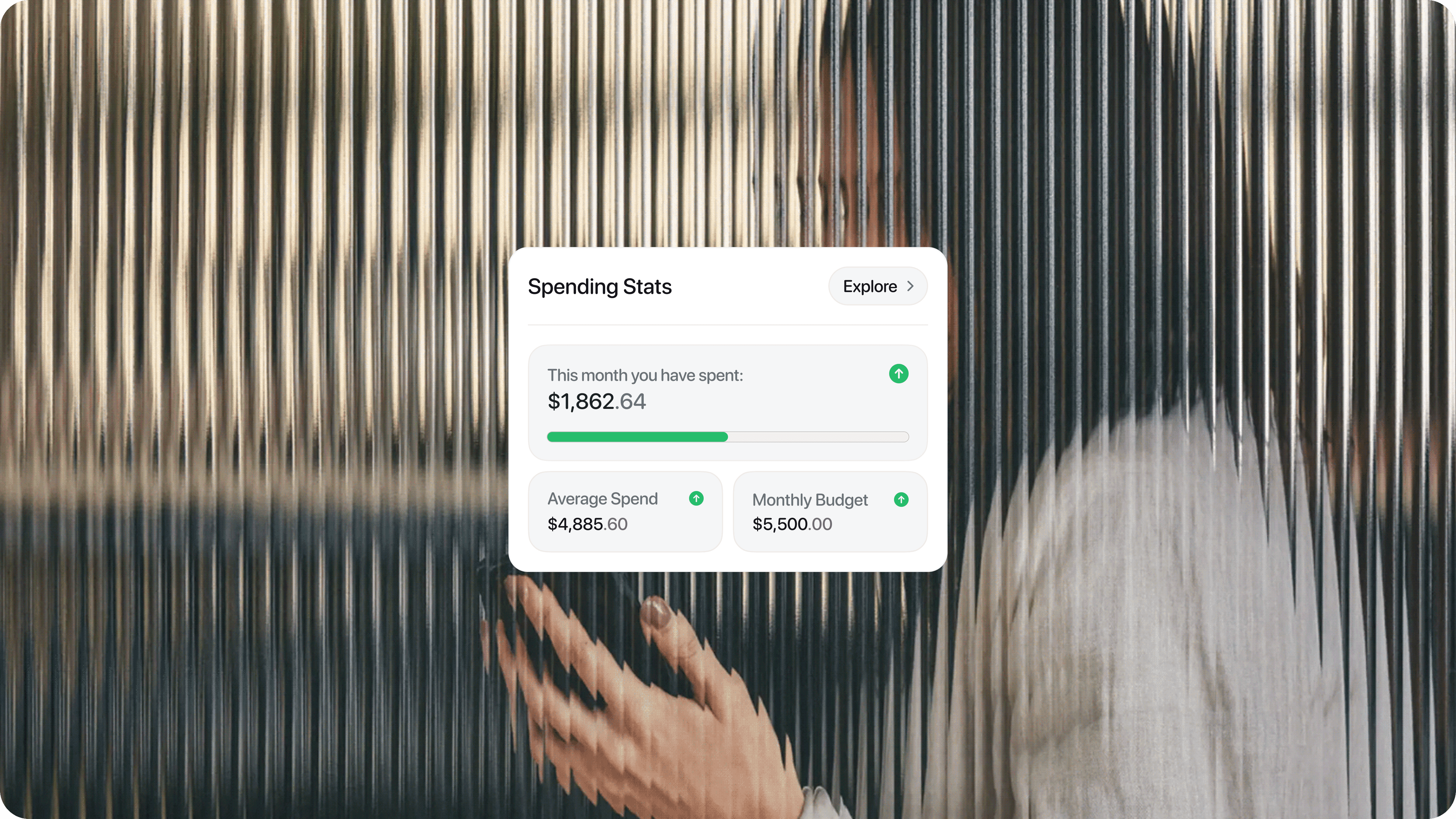
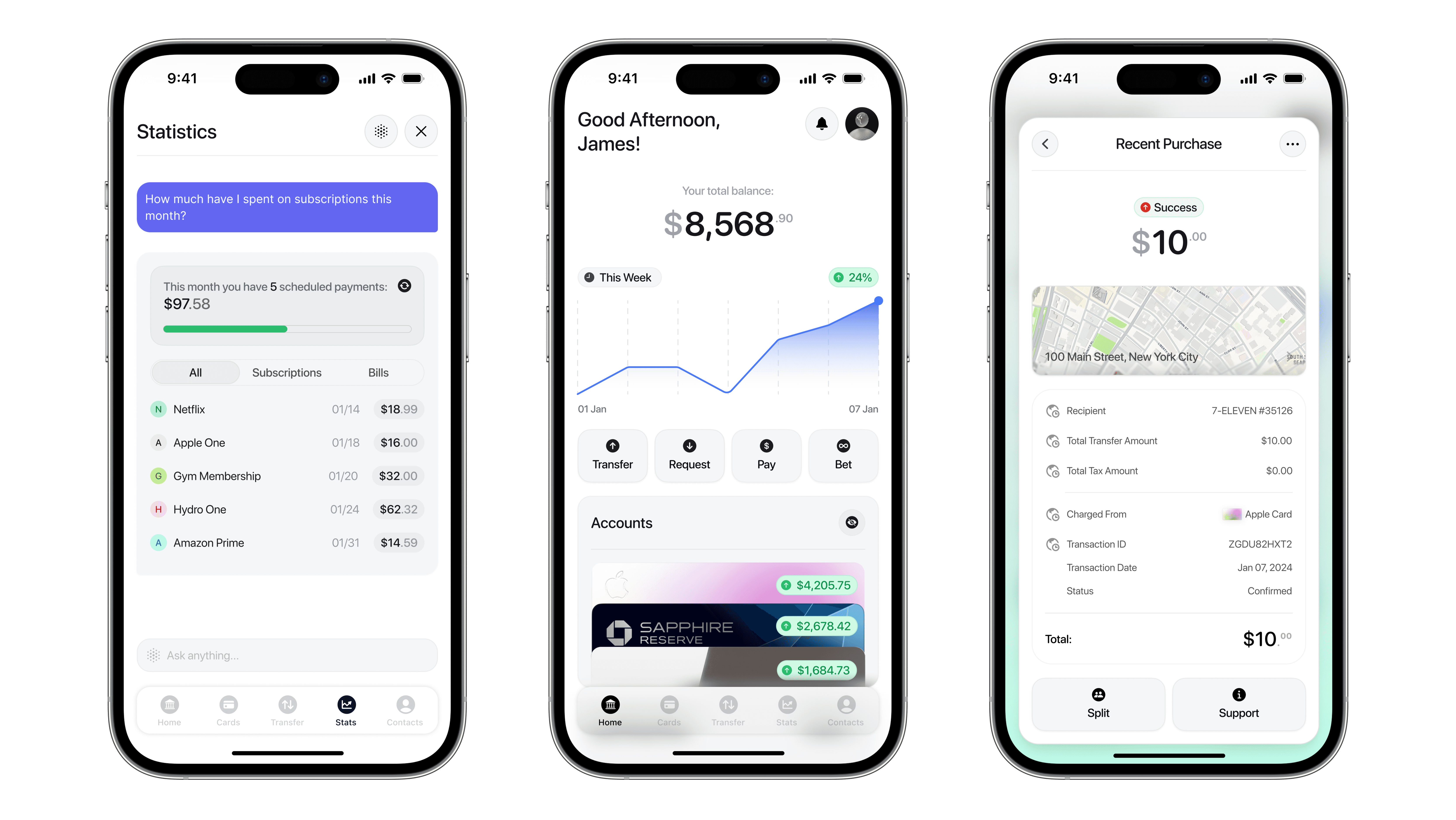
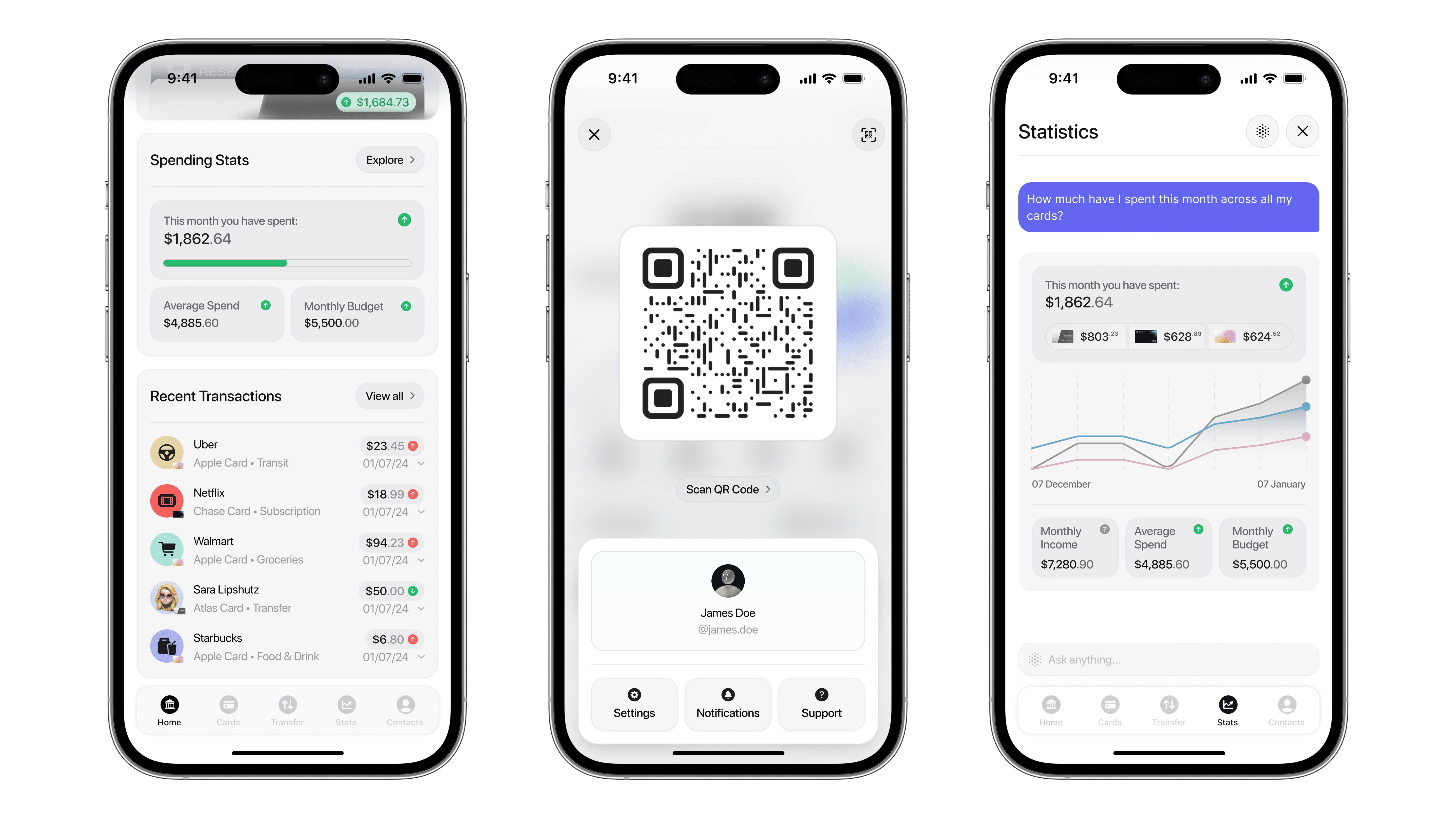
AI-Powered Stats Chatbot
LoopPay’s AI assistant, built into the stats page, lets users ask questions about spending, betting, and habits. Turning static data into smart, actionable insights.
To ensure these features addressed real needs, I created a focused user persona and designed flows around their daily financial behaviours. LoopPay blends functionality with personality, offering both precision and play in how this user moves and manages their money.
User Persona
To guide design decisions, I created a focused persona: Oliver, a 28-year-old marketing professional in Chicago. With an active social life, he regularly makes friendly bets and splits costs with friends, but finds managing the details frustrating. He needs a financial tool that simplifies shared money moments while keeping things social, clear, and low-stress.

Oliver
The Social Bettor
“I love betting with friends, but keeping track of who owes what always turns into a mess.”
Key Points
Unclear bet outcomes
He’s often unsure who won or how much is owed, leading to awkward follow-ups and disputes.
Manual money tracking
Oliver typically uses chat threads, notes apps, or memory to track group expenses and casual bets.
Disjointed payment experience
Sending money, requesting splits, and tracking balances across multiple apps feels clunky and time-consuming.
Oliver’s experience isn’t unique. Many users echoed the same frustrations in survey responses:
“I’m constantly chasing people for their share of rent and subscriptions. It’s exhausting trying to keep track of it all.”
- Maya, Survey Participant
“I use three different apps just to check balances, send money, and split dinner. Why can’t it all be in one place?”
- Survey Participant
These real-world insights directly shaped LoopPay’s direction, helping ensure that users like Oliver get a seamless, collaborative, and conflict-free experience when it comes to shared money moments.
User Journey
The LoopPay Solution
Oliver uses LoopPay Bets to create the wager with clear terms, invite participants, and automate payouts, eliminating confusion and making the process easy and fun from start to finish.

Inspiration for LoopPay


Early Iterations / Sketches
The first design goal for LoopPay was to create a home screen that felt active, engaging, and personal, not cold or transactional. The aim was to make the financial experience feel more like interacting with a card game than navigating a spreadsheet.
Early sketches explored how a user’s cards, balances, and transfers could live together in a wallet-style layout, with each card representing an account or financial action. These cards became the foundation for how the entire app would move, not just visually but functionally.
Instead of pushing users deep into rigid input flows, I tested layered card overlays that would surface one at a time. It started with the home view, then stacked new cards for incoming requests, bets, or transfers. Each interaction felt like flipping over the next move, keeping things clean, contained, and reversible. This structure helped users stay oriented while reducing friction in tasks like sending money, reviewing notifications, or building a bet.
Alongside these home screen experiments, I also tested overlay behaviors for things like transfer input, live payment status, and incoming notifications. These elements built on the core card system, reinforcing the idea that LoopPay doesn’t push users into unfamiliar menus but simply deals them the next card to keep things quick, contextual, and fun.
These early explorations grounded the final experience. LoopPay became a finance app that feels collaborative, intuitive, and structured without losing clarity or control.
User Flows
LoopPay’s user flows were designed to make social betting and group transfers feel easy, clear, and conflict-free.
For betting, the flow guides users through setting terms, adding collateral, and inviting friends in one smooth, guided process. This keeps things simple while avoiding the confusion that usually comes with informal bets.
In group transfers, users can itemize expenses and track who’s paid right away. The flow makes it easy to stay on top of shared costs without extra reminders or awkward follow-ups.
Both flows were built to reduce friction and help users like Oliver move money quickly and confidently.
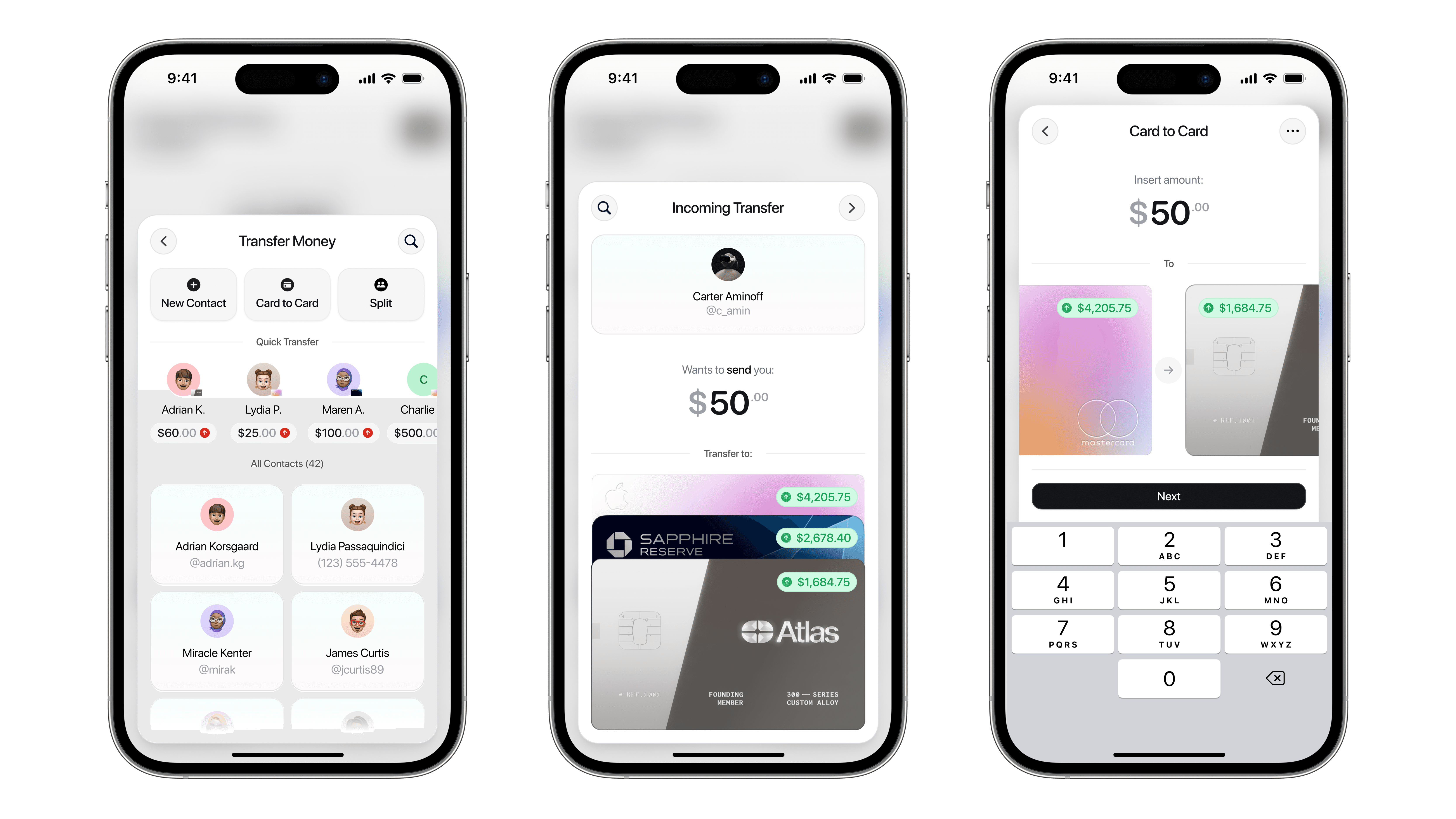
Wireframes
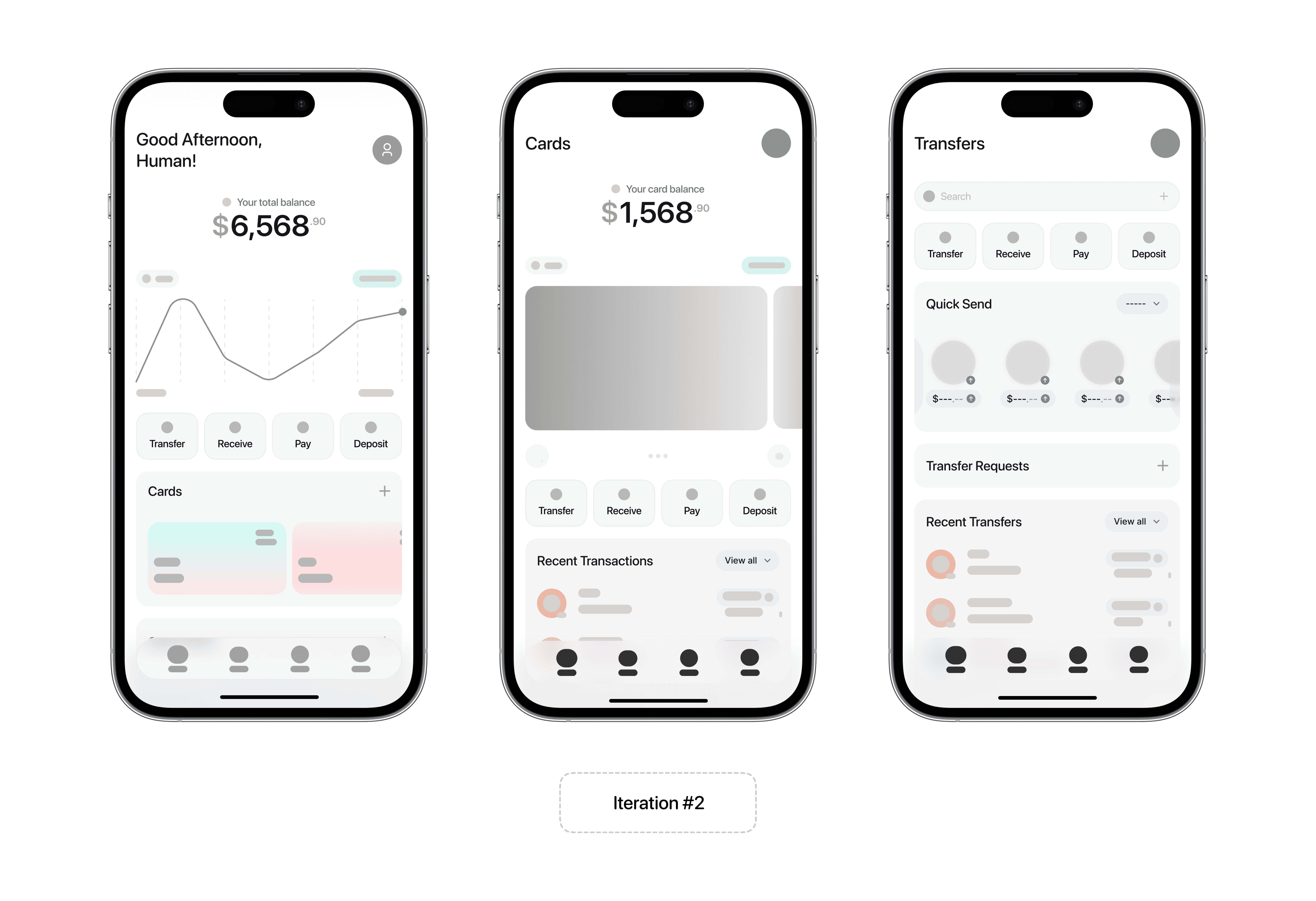
The early wireframes helped shape LoopPay’s tone: functional, social, and easy to navigate. The wireframes for LoopPay focused heavily on how the social betting and group transfer features would integrate into the overall flow without overwhelming the core finance experience.
I spent most of my time designing how users would create, track, and resolve bets in a way that felt lightweight yet structured. Key elements included a step-by-step bet creation flow, an active bets dashboard, and a resolution screen for handling outcomes clearly.
For group transfers, I explored ways to surface itemized splits and real-time payment statuses while keeping the interface clean and intuitive. The goal was to balance utility with approachability, showing users just enough detail to feel in control without adding friction.
These early wireframes helped shape LoopPay’s tone: functional, social, and easy to navigate.
Solution 1
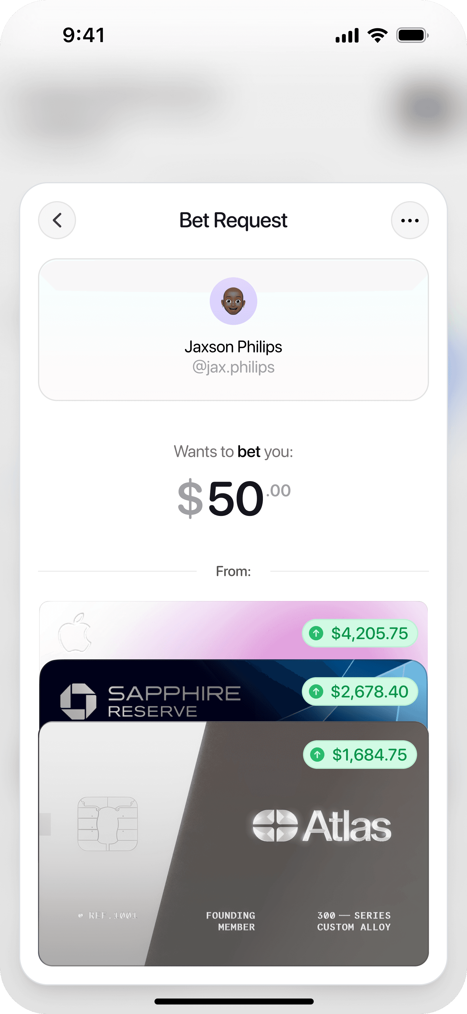
Introducing: LoopPay Bets
What is LoopPay Bets?
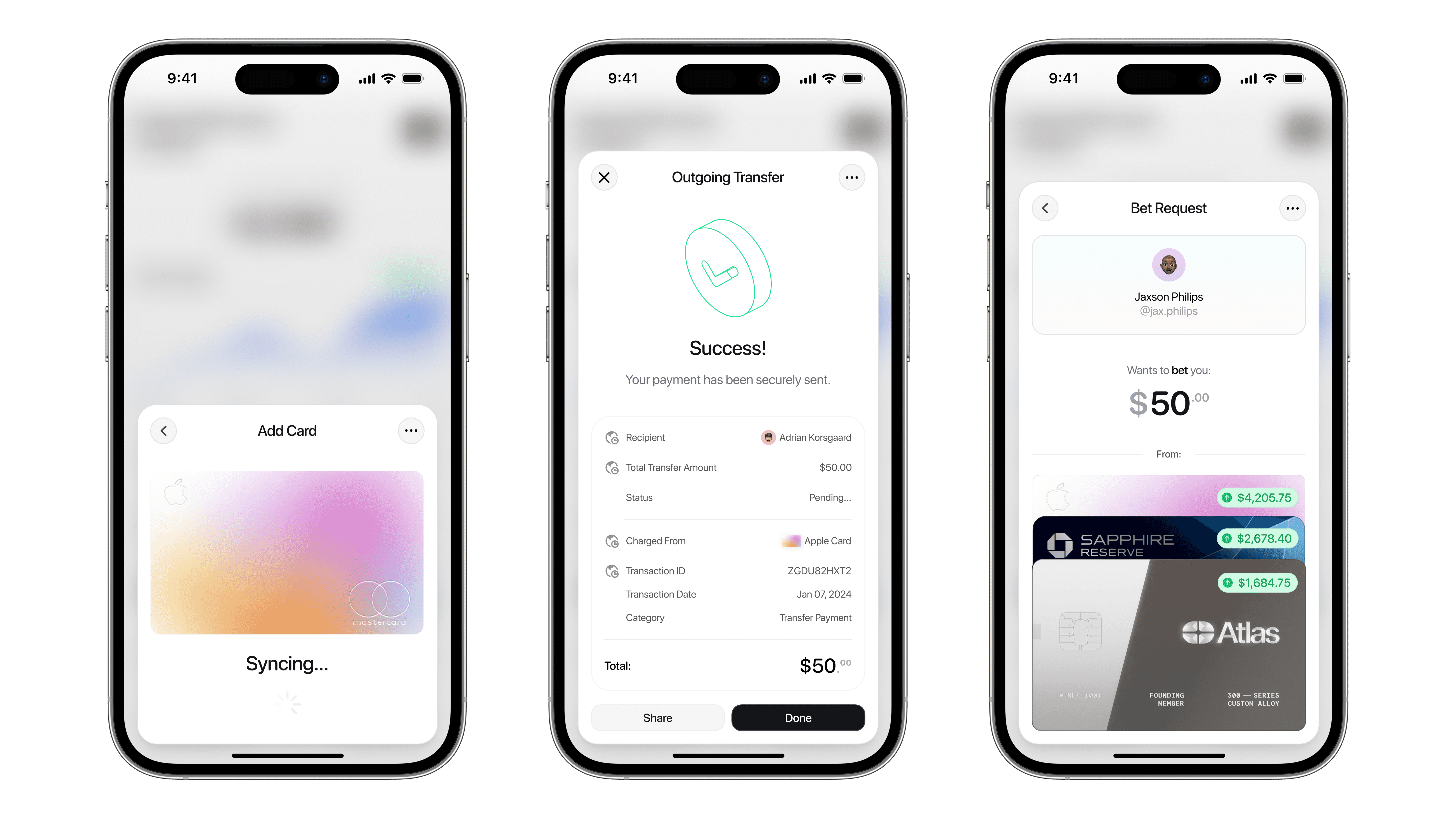
A structured, fun, and social way to place friendly bets with friends. With features like clear terms, automated collateral management, and optional “Sell Out Fees,” LoopPay makes casual betting seamless, secure, and dispute-free.
What Sets LoopPay Bets Apart?
Guided Bet Creation
Set clear terms, stakes, and deadlines in a smooth, step-by-step flow.
Optional Collateral
Add accountability by requiring an upfront commit-ment from participants.
Transparent Resolution
Track outcomes, notify participants, and trigger automated payouts with no room for dispute.
LoopPay doesn’t just support casual betting, it elevates it with clarity and convenience.
Why Add Betting to a Finance App?
Because money isn’t always transactional. It’s social, shared, and emotional. Betting taps into our basic motivators like competition, connection, and the thrill of winning, and ties them into everyday financial interactions.
LoopPay Bets turns money movement into something more engaging. It deepens in-app interaction, encourages repeat usage, and helps build financial habits that are both entertaining and collaborative.

“Friendly competition activates positive emotional responses and deepens social bonds, especially when the experience is easy and fair.”
- Inspired by Reality is Broken by, Jane McGonigal
Why Betting?
Betting is familiar, playful, and emotionally charged. Whether it’s over sports, goals, or weekend plans, friendly wagers are part of how people connect. But in real life, these bets often lack structure and can lead to awkward disputes.
LoopPay solves this with a clean, guided interface that lets users set clear terms, add optional collateral, and resolve bets with full transparency. It makes the experience of betting just as enjoyable as the outcome.
By turning something informal into a structured flow, LoopPay reduces friction while keeping what makes betting fun: competition, connection, and a little risk.
Key Features
Structuring casual wagers with clear, guided terms to avoid confusion or disputes.
Tracking all active and past bets in a dedicated, organized dashboard.
Allowing users to add optional collateral for increased accountability.
Offering a “Sell Out Fee” to let users exit bets early under fair conditions.
Resolving outcomes through transparent, in-app confirmations from all parties.
Automating payouts to remove the need for manual follow-ups.
How does it work?
Solution 2
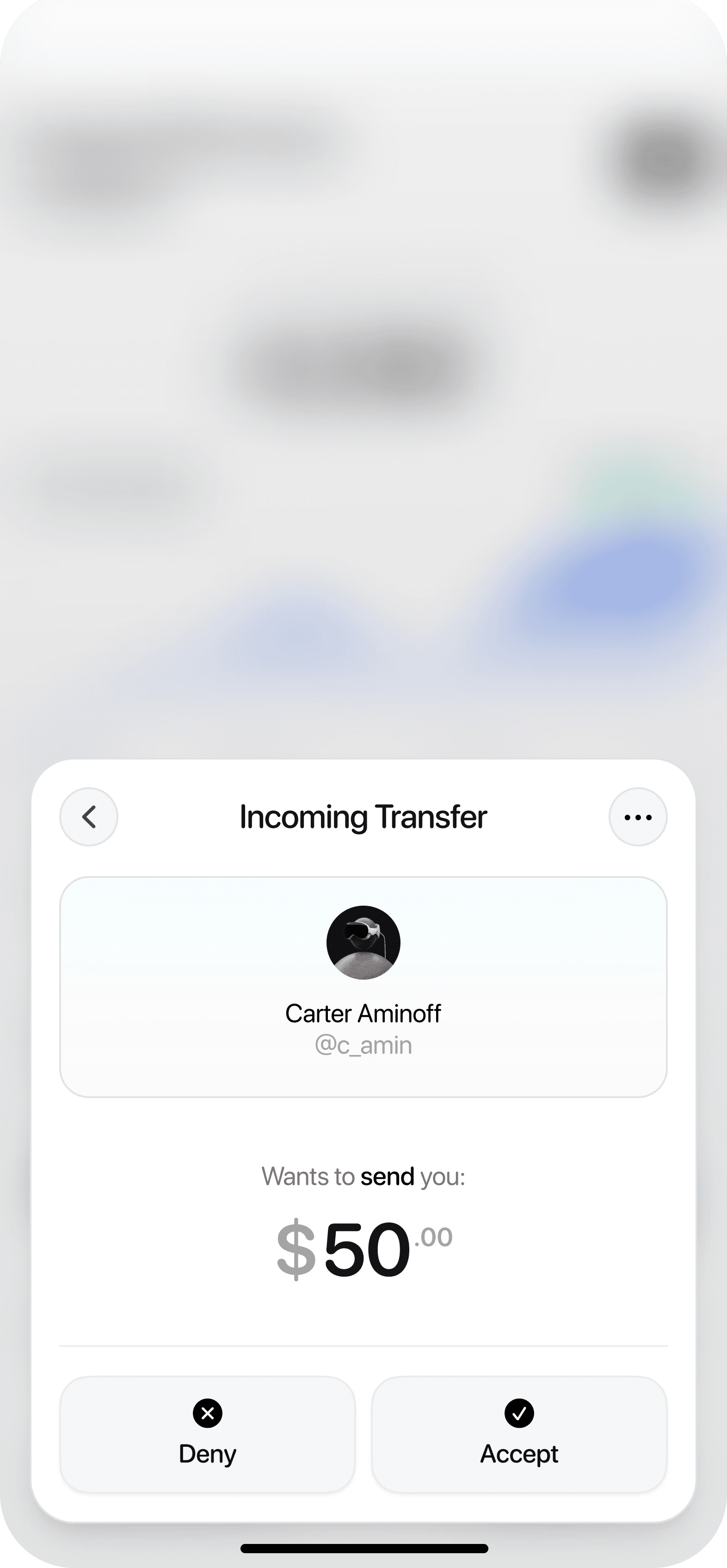
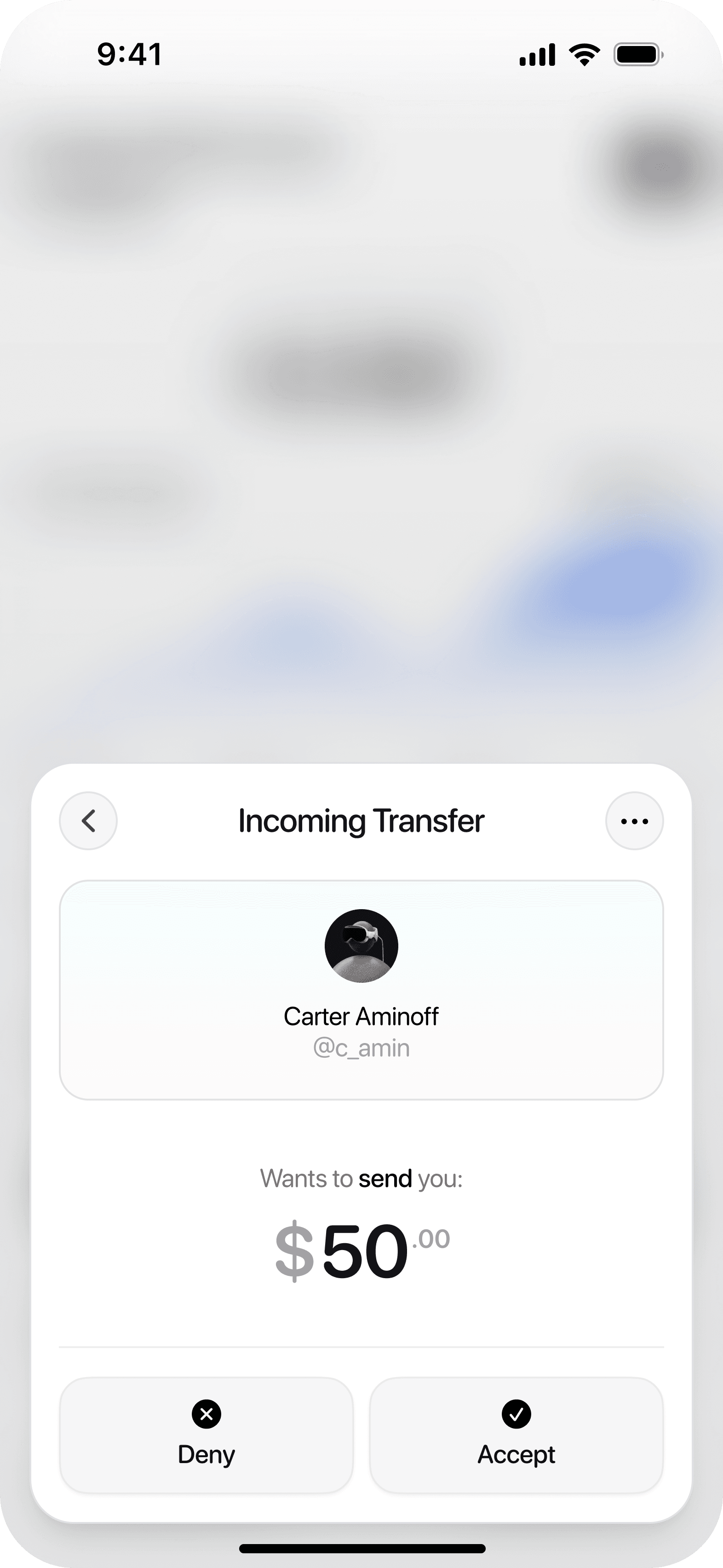
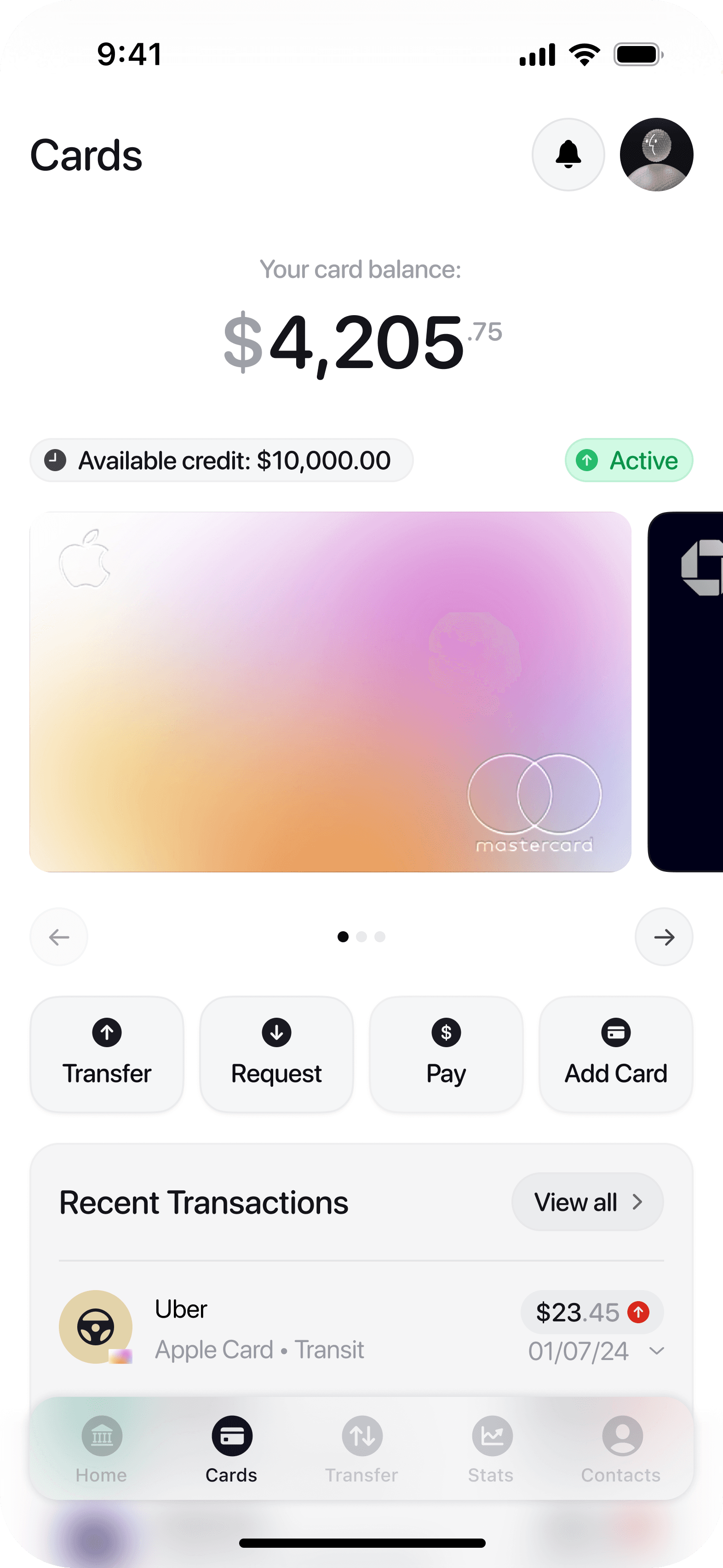
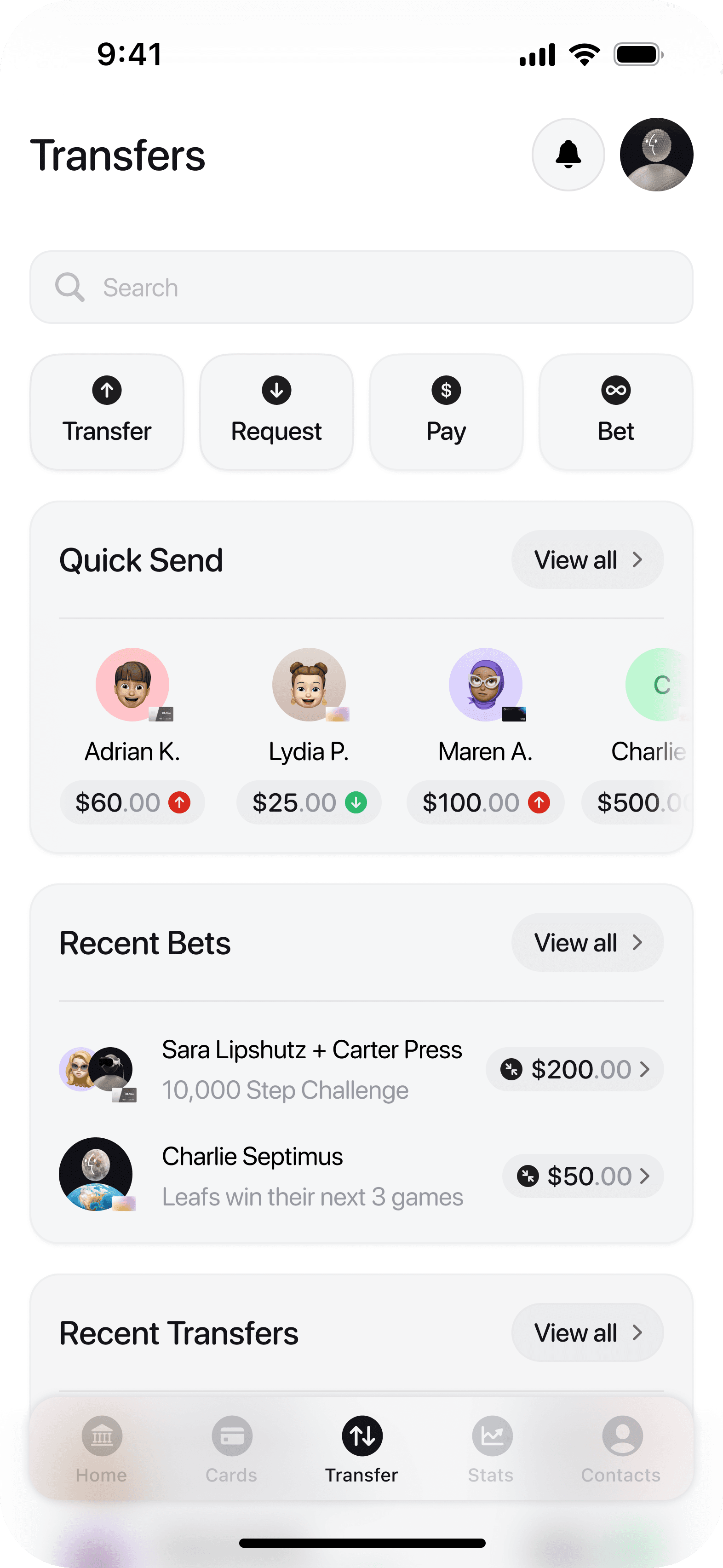
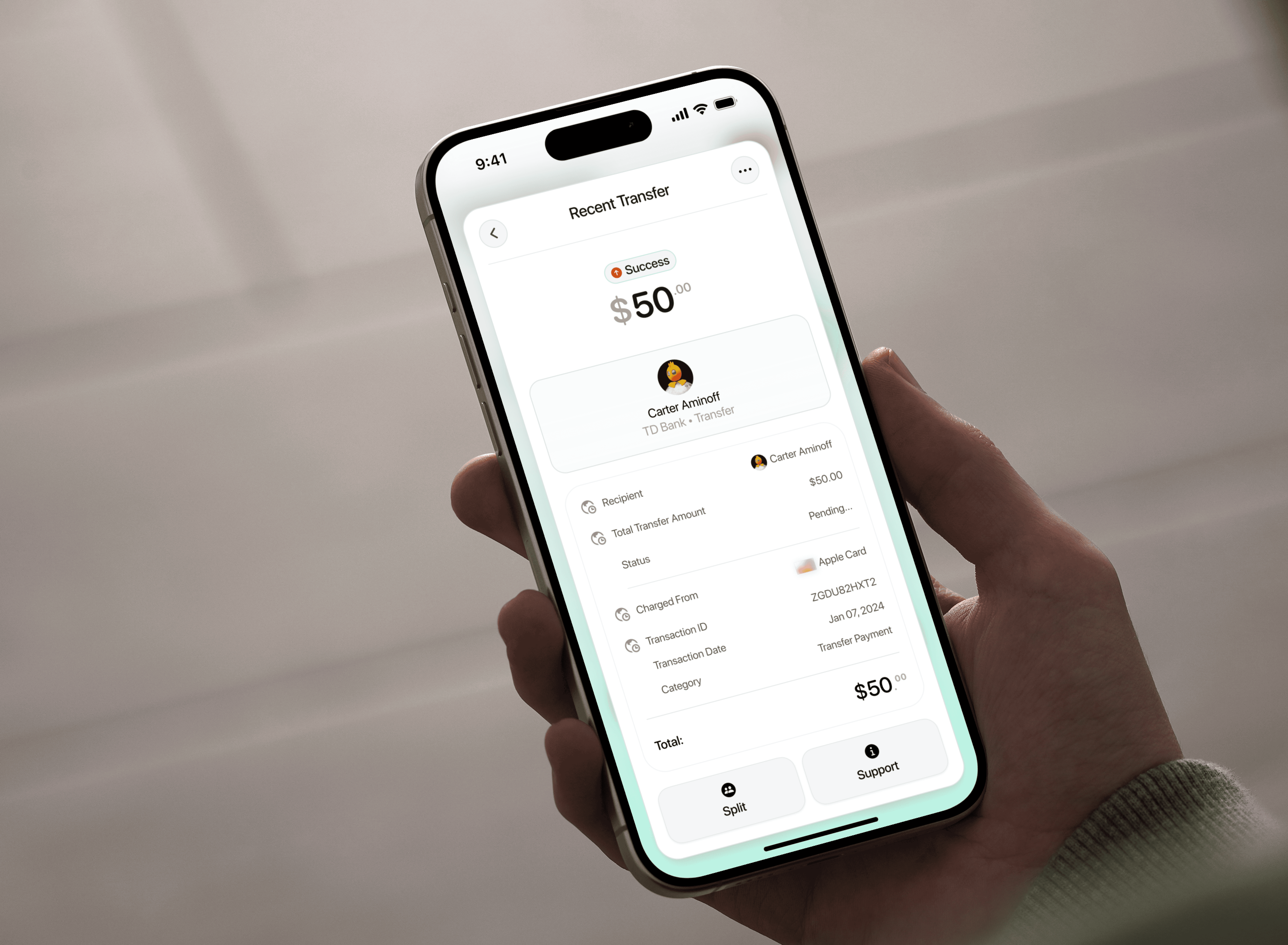
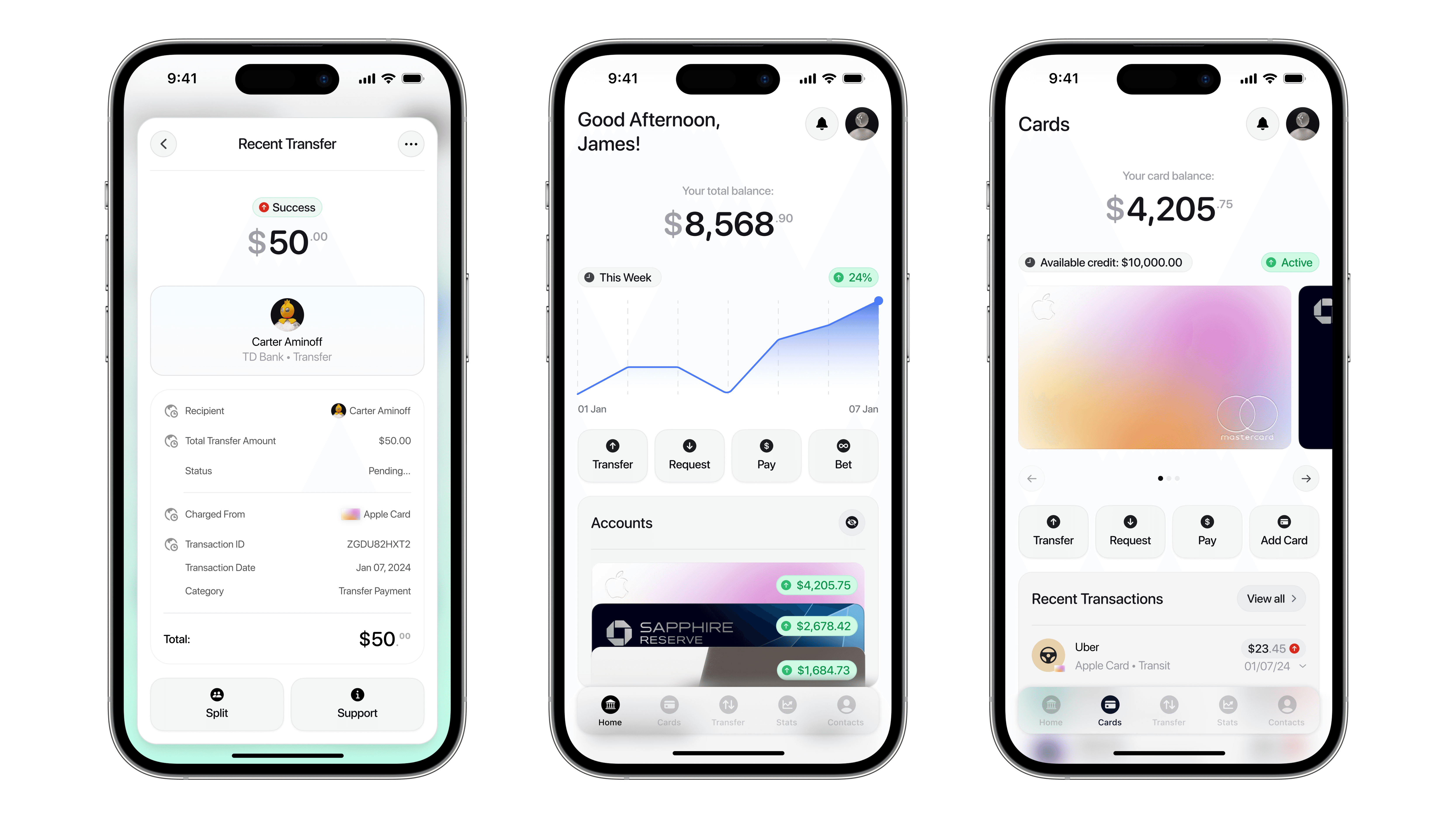
Introducing: LoopPay Transfers
LoopPay’s transfer system goes beyond sending money. It’s designed to track, automate, and organize the recurring payments and requests that make up everyday life. Whether it’s rent, subscriptions, shared bills, or that friend who always pays you back late, LoopPay helps you stay on top of it all without the mental load.
Why Rebuild Transfers?
Sending money might be simple in most apps, but staying on top of who you’ve paid, who still owes you, and what’s coming up next isn’t. Users often rely on memory, screenshots, or text threads to track recurring payments, which leads to missed bills, forgotten requests, and awkward follow-ups.
LoopPay fixes this by giving users a central hub for everything they’ve sent, received, or scheduled, complete with clear status updates and automated reminders.
What Makes It Different?
Itemized Transfers & Requests
Break down exactly what a payment is for. Whether you’re paying someone back for dinner or requesting your half of a shared Airbnb, itemized lists ensure full clarity.
Recurring Transfers & Payments
Set up monthly rent, shared streaming services, or regular loan repayments, and LoopPay will take care of the rest.
Scheduled Reminders
Never chase down a friend again. LoopPay keeps quiet nudges going in the background until payment is settled.
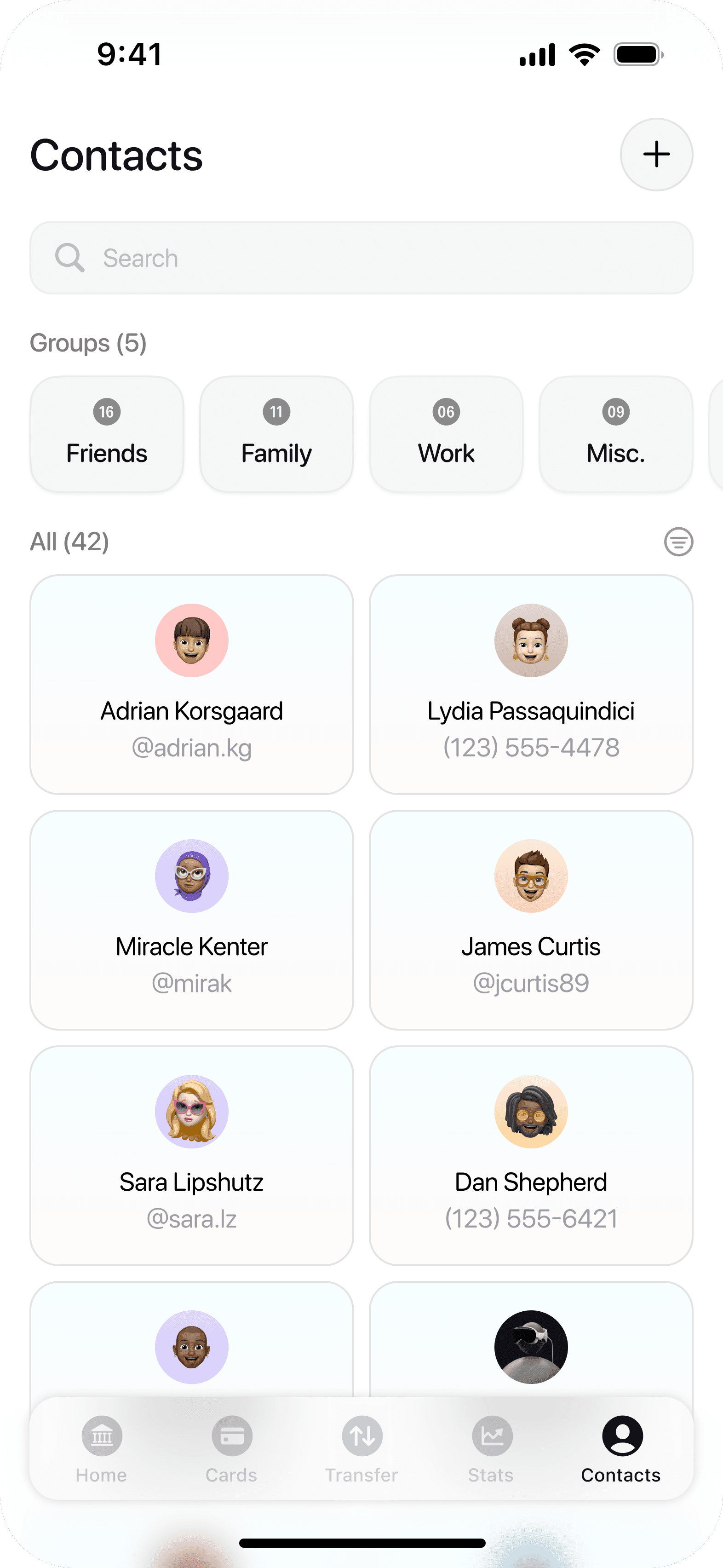
Smart Group Splits
LoopPay makes it easy to divide costs among multiple people, track who’s paid, and send reminders when needed.
Unified Transfer Hub
View all upcoming, pending, and completed payments in one place — whether it’s personal, group, or recurring.
Contextual Notes & Tags
Add quick notes (like “March utilities” or “Vegas trip split”) to keep your transfers organized and searchable.
Why It Matters
Managing shared and recurring expenses isn’t just about money; it’s about keeping relationships smooth and stress-free. With LoopPay, users gain peace of mind knowing their payments are tracked, on time, and clearly communicated.
How does it work?
Feedback & Iterations
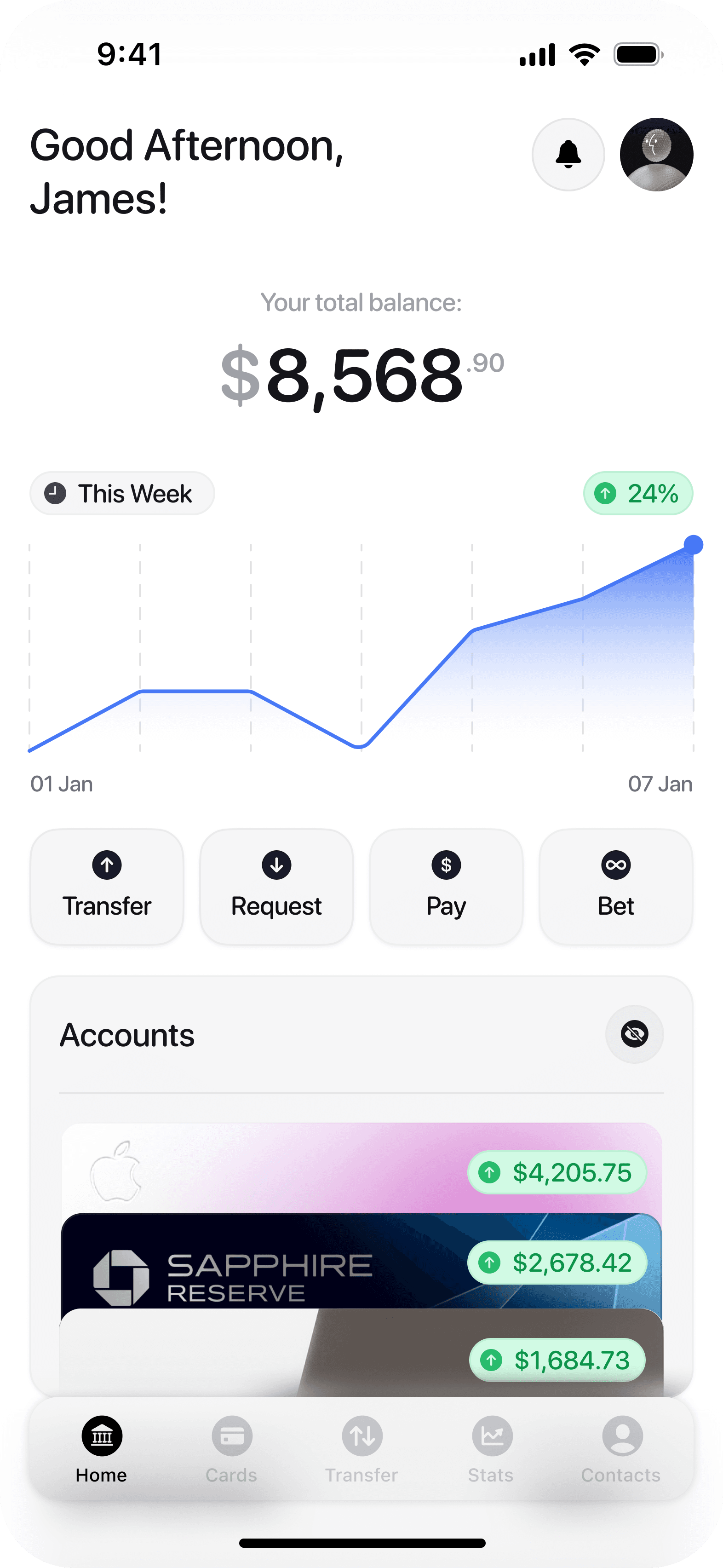
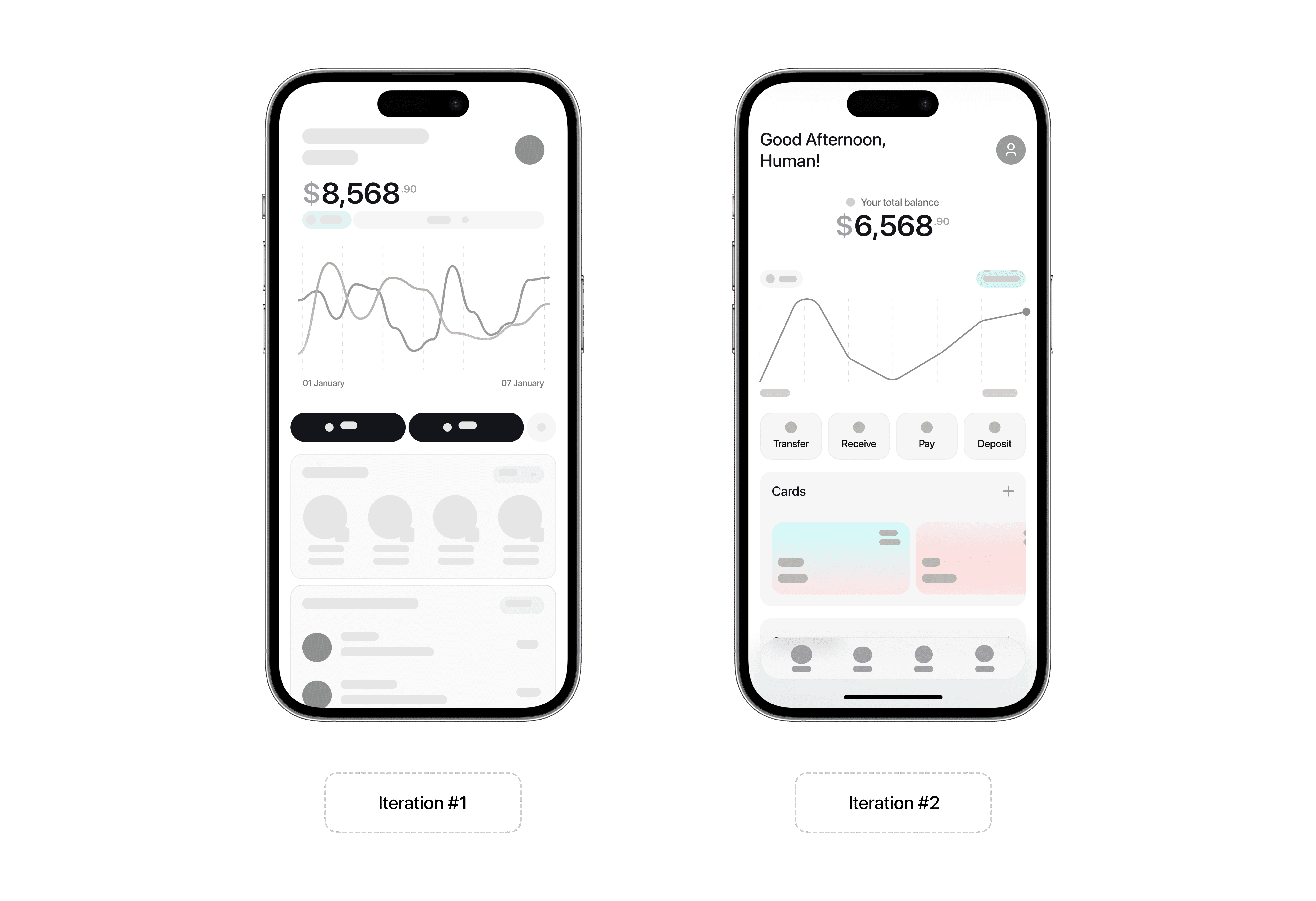
The initial vision for LoopPay’s home screen was to create a clean, engaging snapshot of a user’s financial status. It needed to scale across multiple accounts, balances, and key app functions without becoming cluttered or visually overwhelming.
Three interface directions were tested with users:
Option A: A dark mode layout with a chart and a prominent balance header. Cards were stacked in a wallet-style format, each displaying its individual balance.
Option B: A light mode version with a vertical, wallet-style stack. Similar to Option A, each card was partially visible, balances were displayed directly on the front, and the total balance was placed in the top centre to maintain context.
Option C: A hybrid design featuring a horizontal card row with shrunken previews and a prominent left-aligned balance. Cards were swiped horizontally, offering a focused but more linear interaction.
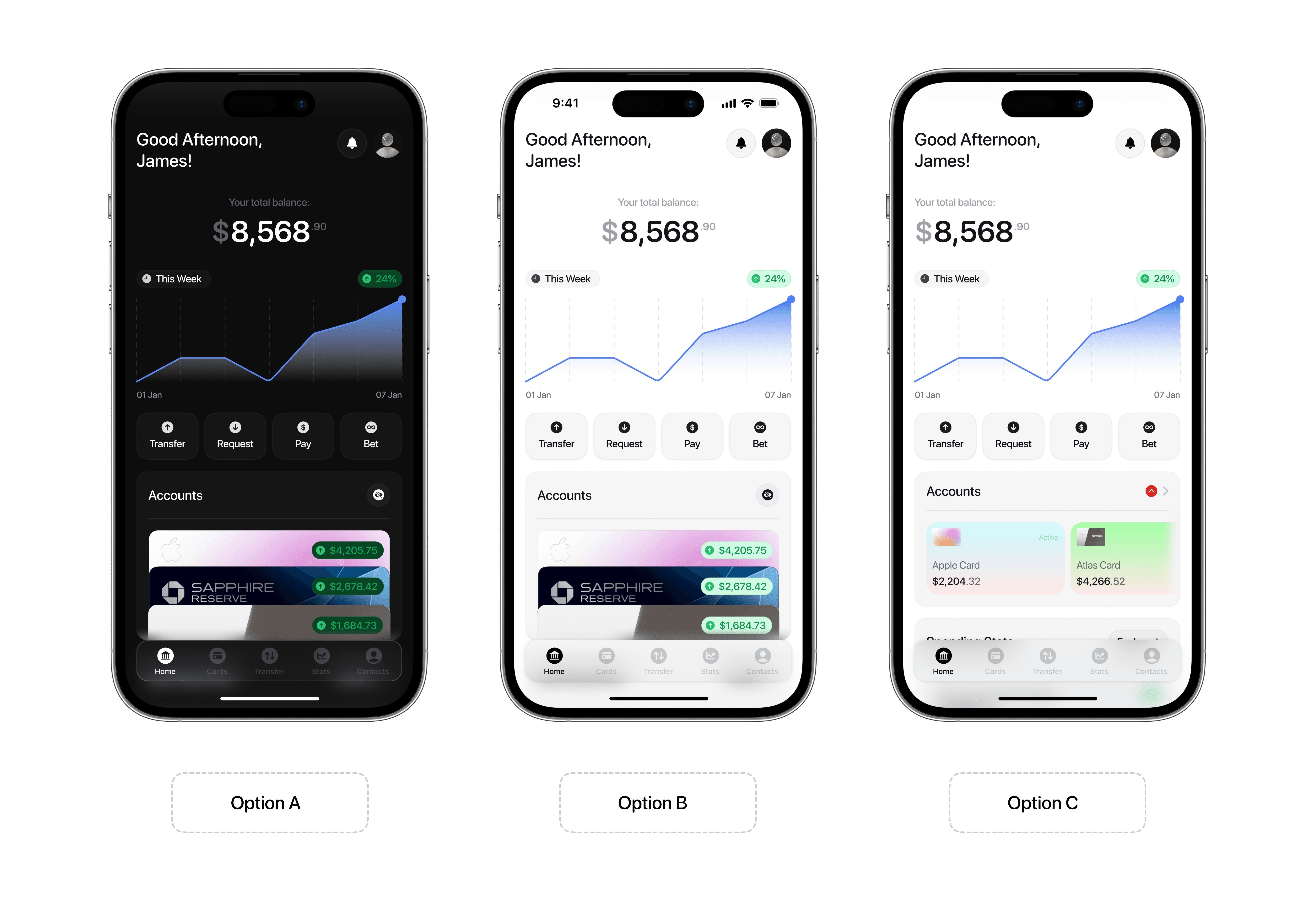
During usability and accessibility testing, Option C presented key challenges. Smaller card previews made it harder for users to quickly scan balances, and the centered balance header pulled focus away from individual accounts. These issues became more noticeable for users managing multiple cards or switching between them frequently.
Usability Testing
Survey respondents, peer testers, and informal interviews with 6 repeat participants
KPIs
Task completion rate for itemized transfers and group split confirmations
Number of repeated bets created per user during testing phase
User confidence rating after completing transfers or bets
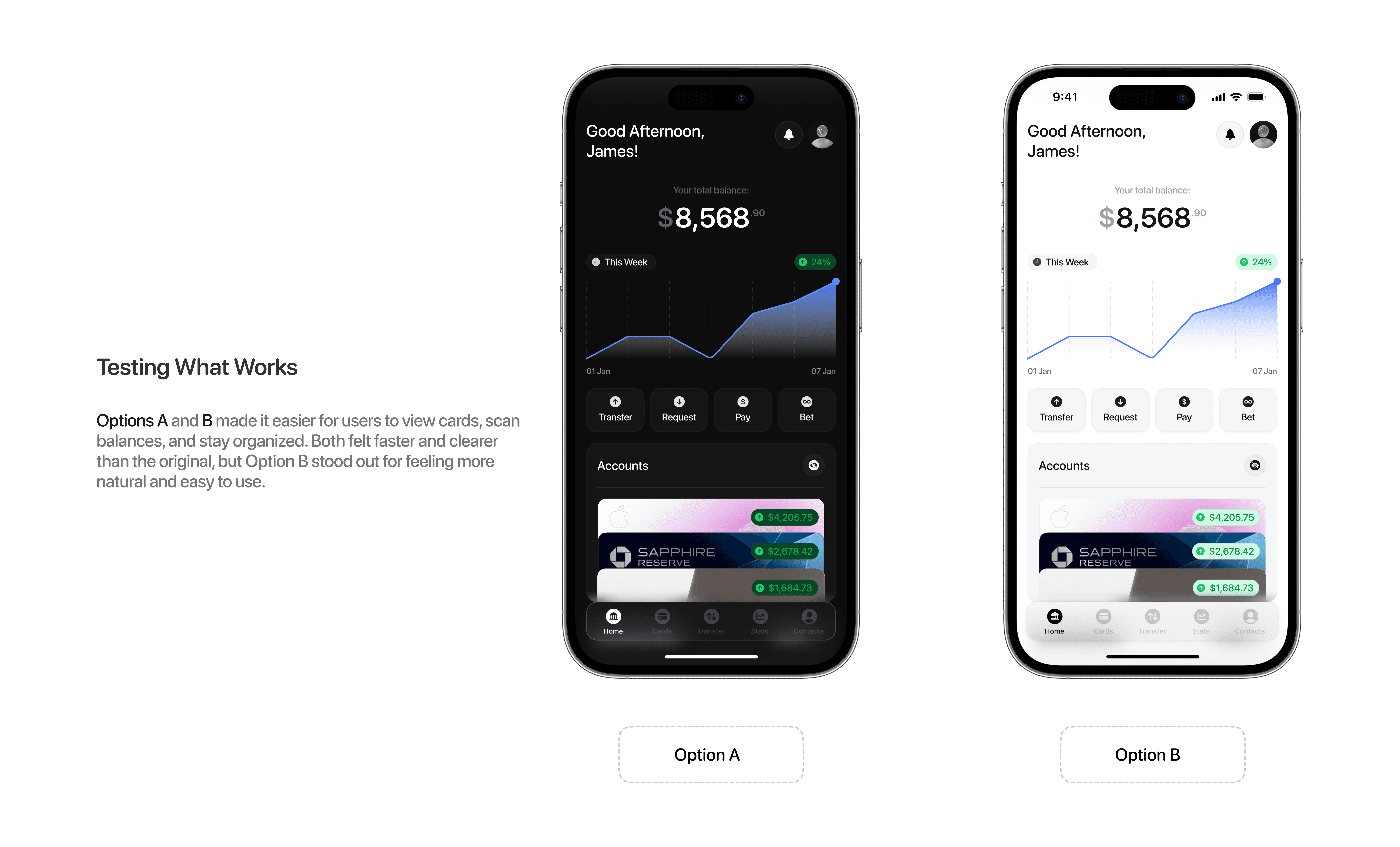
Testing Insights
Users preferred the stacked layout because it looked and felt like a real wallet.
Seeing each card’s balance up front made it easier to compare and decide which to use.
Moving the total balance to the top centre made the screen feel cleaner and more focused.
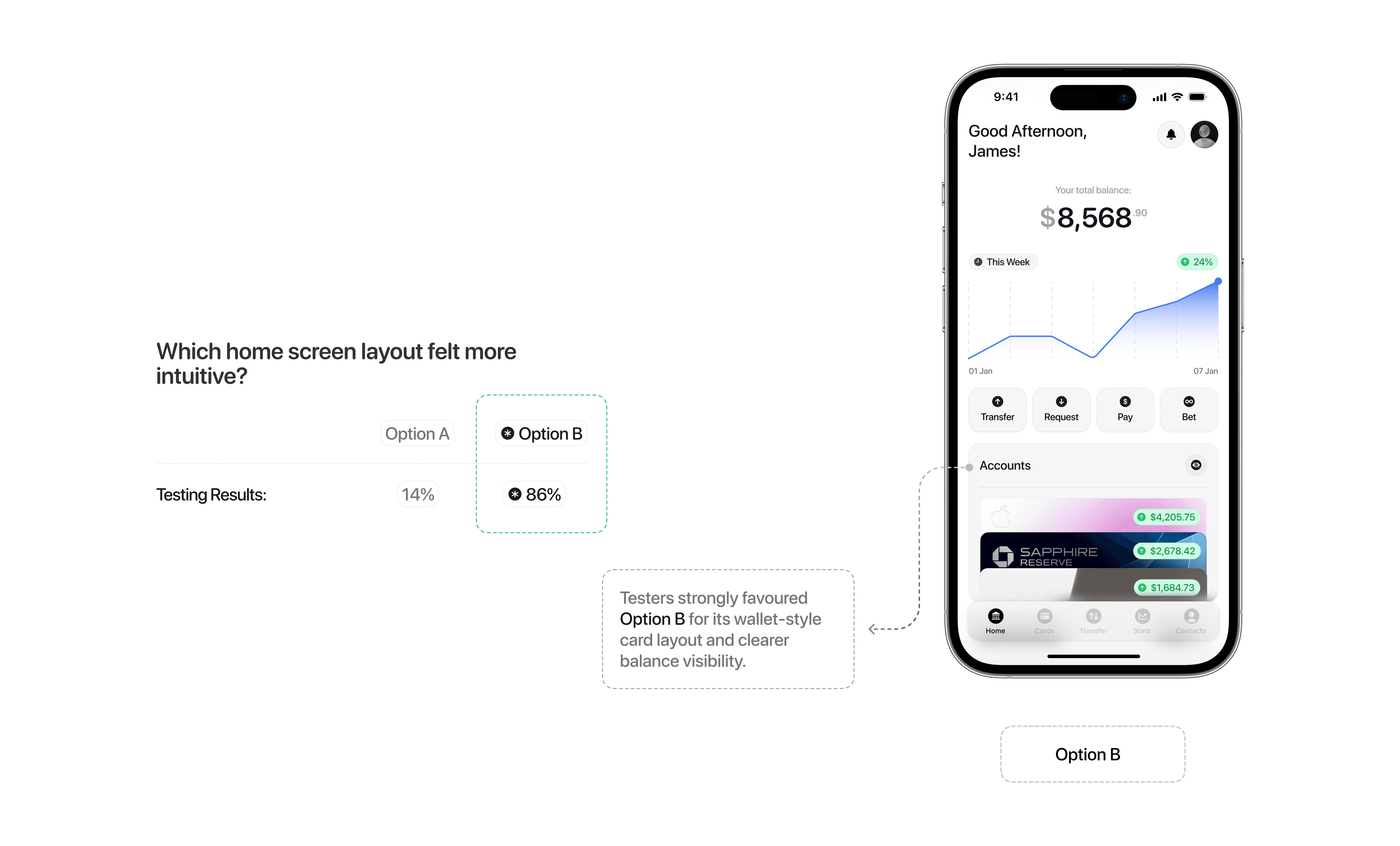
Key Decision
Feedback consistently favoured the vertical wallet layout. Option B, the light mode version, was selected as the final direction. The card stacking, swipe interactions, and centre-aligned main balance made it easier for users to scan financial details and navigate their accounts with clarity.
Branding
Crafting the identity of LoopPay
Designing LoopPay meant thinking beyond functionality to shape an identity that feels calm, social, and trustworthy. I explored how the visual language, through colors, typography, and tone, could reflect the app’s purpose: making money more collaborative and less stressful. The result is a brand that feels modern but approachable, structured but never stiff.
Icon / Logo

The infinity loop symbol was chosen to represent LoopPay’s core idea: a continuous, fluid movement of money between people, accounts, and shared responsibilities. Simple, clean, and memorable, the black and white icon is designed for versatility across light and dark backgrounds. It fits naturally in both personal and professional settings. The loop also reflects the app’s mission to simplify recurring payments, shared expenses, and everyday financial habits.
Name

The name LoopPay captures exactly what the app aims to do: keep money moving in a loop that feels intuitive, predictable, and shared. Whether you’re sending rent, splitting a weekend trip, or tracking a bet, LoopPay reflects the kind of financial habits that cycle through our daily lives.
It also rolls off the tongue and feels familiar without being generic. “I’ll LoopPay you” is meant to sound just as natural as “I’ll send it.” Short, flexible, and memorable, the name supports the app’s role in everyday routines.
Colors
The LoopPay colour system was designed to feel clear, modern, and approachable. With a focus on usability and calmness, the palette uses neutral tones and soft gradients to support a clean, trustworthy financial experience. These choices help reduce visual noise, improve accessibility, and guide attention to what matters most, while still making room for expressive accents during key interactions or celebrations.
Primary Brand Colors: These tones make up the foundation of the UI, ensuring content remains legible and lightweight across both light and dark modes. The visual system avoids harsh contrasts and instead uses minimalism to reduce cognitive load.
White #FEFEFE — Used for main backgrounds to promote cleanliness and clarity.
Light Gray #F5F5F7 & #E4E4E4 — Provides subtle contrast for borders, buttons, and panels.
Secondary Colors: LoopPay uses green and red sparingly but effectively, to signal performance or stat
Green #3DDC84 — Highlights balance increases, successful transfers, and positive activity.
Red #FF5A5F — Indicates losses or outgoing funds, such as lost bets or payment requests.
Typography
SF Pro
Aa
Bb
Cc
Dd
Ee
Ff
Gg
Hh
Ii
Jj
Kk
Ll
Mm
Nn
Oo
Pp
Rr
Ss
Tt
Uu
Vv
Ww
Xx
Yy
Zz
0
1
2
3
4
5
6
7
8
9
LoopPay uses a combination of SF Pro Rounded and Inter to balance structure with warmth. SF Pro Rounded brings a softer, more approachable feel to core elements like buttons, labels, and action flows, which aligns with LoopPay’s tone as a collaborative, social finance tool. Inter supports body text and system-level information with sharp clarity and high legibility, especially in stats, itemized lists, and transaction summaries.
Together, they help LoopPay feel modern, professional, and human, built to make complex financial tasks feel effortless and approachable.
Designed in Figma & Prototyped in CreatewithPlay

Designing LoopPay in Figma wasn’t just about making clean screens. It was about building a system that could scale alongside the pace of a user’s financial life. Even as a concept project, I treated the process like a real product build to maintain consistency, reduce UI clutter, and speed up iteration across flows like betting, group transfers, and recurring payments.
One of the earliest design decisions was to set up a modular, reusable design system. Common components such as transfer cards, account tiles, itemized expense lists, and notification banners were all designed to adapt across multiple use cases, from single transfers to multi-user requests. Instead of duplicating screens, I used layer toggles and flexible overrides to quickly test variations without breaking the overall structure.
Design System Thinking
Was building a structured design system necessary for a solo concept? Technically, no. But for LoopPay, it was essential to keep the project focused and future ready. Creating dynamic components encouraged me to stay intentional with every element. If something wasn’t likely to be reused, it had to earn its place.
For example, the itemized transfer rows and recurring transfer tiles were built as variants instead of one-offs. This allowed me to mix and match elements across different flows, such as requests versus scheduled payments, without redrawing anything. Similarly, bet confirmation modules and contact chips were designed with scalability in mind, so they could live comfortably on a dashboard, inside a modal, or within a message thread.

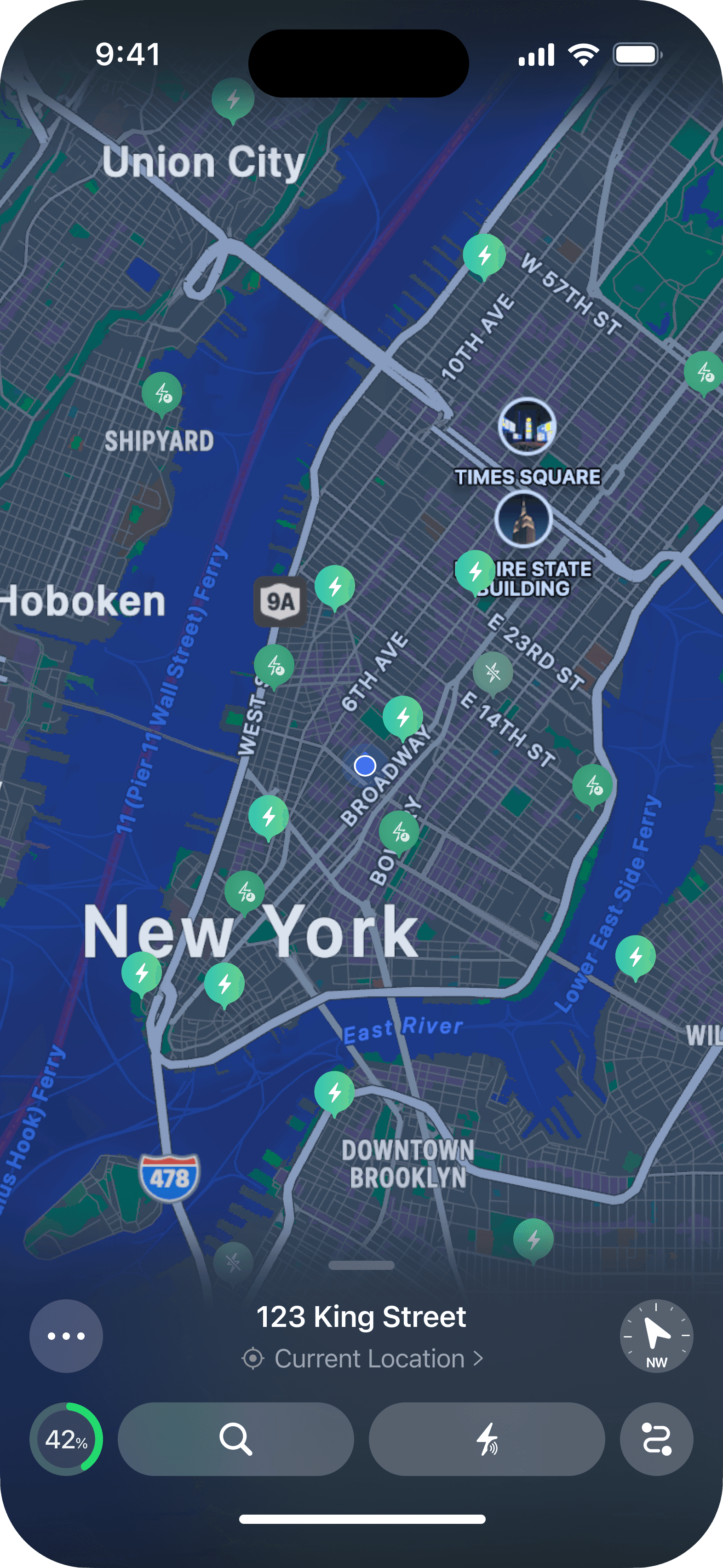
Modular components (charger cards, route overlays) allow for easy feature expansion.
Scalable UI system ensures a consistent, adaptable experience across platforms.
Accessibility-first approach guarantees clarity, ease, and efficiency for all users.
Outcome
Outcome
The result of this solo project is LoopPay, a concept finance app that introduces two core features to solve two very different but common user frustrations: unclear, informal financial collaboration and disorganized recurring payments. Together, LoopPay Bets and Smart Transfers with Reminders provide tailored solutions that feel structured, approachable, and built for real people.
LoopPay doesn’t try to reinvent banking. It simplifies what users already do: split costs, send payments, and place casual bets with friends. These flows were designed to feel fast, flexible, and trustworthy, especially for users who rely on memory, text threads, and scattered apps to keep things in order.
How These Features Solve Real User Pain Points
LoopPay Bets:
Eliminates confusion around casual bets with guided setup and clear terms, reduces awkward follow-ups through automated tracking and payouts, and makes financial interactions feel more social and engaging.
LoopPay Transfers:
Simplifies complex group payments with itemized splits and live tracking, prevents missed payments through recurring transfers and reminders, and reduces the mental load by centralizing all transactions in one place.

As a concept project, LoopPay reflects my ability to take a problem-led approach by grounding ideas in user insights, creating focused personas, validating through design systems, and building high-fidelity flows that scale. The entire experience was designed and prototyped with product thinking in mind, focusing on how features interact, how they evolve, and how they support long-term engagement.
Users like Oliver engage more frequently through bets, creating natural social touchpoints within the app.
Users return regularly to manage rent, subscriptions, and group expenses with less mental overhead.
And users looking for better financial oversight rely on LoopPay’s dashboard to track spending and stay organized.
The expectation is that a product like LoopPay could meaningfully improve mobile finance by:
Increasing user retention through features that make money more social, structured, and personal
Improving financial clarity with reminders, itemization, and real-time status tracking
Reducing friction in peer-to-peer interactions, making group payments and casual bets easier to manage
The long-term vision is a finance app that isn’t just smart. It’s habit-forming in the right way: clear, clean, and collaborative.
Retrospective
A key part of any solo UX project is stepping back to reflect on what worked, what could be better, and where the biggest opportunities for growth lie. LoopPay was built as a concept grounded in real user frustrations, and designing both the social betting and smart transfers systems offered valuable lessons in clarity, collaboration, and systems thinking.
Designed for Simplicity and Confidence
A Unified Research-to-Design Process
Insights First, Features Second
Systems Thinking from Solo to Scale
So what went well?
• Surveys provided strong direction, surfacing clear themes around trust, group payments, and friction in recurring money tasks.
• Building a modular design system from the beginning helped streamline iterations and made multi-feature testing fast and flexible.
• Prototyping in CreatewithPlay brought flows like bet confirmations and scheduled transfers to life, helping test timing and visual feedback early.
• Taking on both the UX and UI roles allowed for tight integration between research and interaction design, ensuring each feature solved a real user need.
That’s nice, but what needs improvement?
• Microinteractions and visual transitions could be more refined to improve perceived speed and reduce the feeling of “hard stops” between screens.
• The survey structure could have been more tailored to behavioral motivations (e.g. “why people avoid following up on payments”) to yield deeper insights.
• There’s room to blend betting and transfers more fluidly, so users can move between social and transactional flows without context-switching.
That’s it!
Working on LoopPay was a rewarding opportunity to take a familiar product category, finance, and explore how it could feel more human, collaborative, and intuitive. From research to systemization, this solo project sharpened my ability to build purposeful features from the ground up and reinforced the importance of designing with real-world behaviour (and friction) in mind.
Big thanks to everyone who participated in the surveys and feedback rounds. Your insights were the heartbeat of this project.